Hey Fitbit, my data belong to me!

When you go on Fitbit’s website and want to download your own Fitbit data, you will find your way to their Data Export utility on their settings page. Once you get there, you are greeted with what looks like a slogan: “Your data belongs to you!”. Having seen the very high level data that they provide you with when you click download, I don’t believe them.

How Orwellian!

How Orwellian!

It’s nice that they let you download even this much data (I really like the sleep tracking feature), and I can at imagine myself being interested in my daily stats as I become more competitive with myself, but:

A) Where’s the heart rate data? I got a Fitbit Charge HR for my birthday, and I happen to like the heart-rate monitor function!
B) What about the intraday data? I am interested in doing further analysis of my heart rate based on time of day.
C) What about the specific activities that I log by pressing the button on the side of my Charge HR and annotate/entitle on the website?

For these reasons, I’m convinced that they don’t really believe that my data belong to me. That’s why it was nice to find out about Corey Nissen’s fitbitScraper package. At the current time, it allows you to get steps, distance, active minutes, floors, calories burned on a 15 minute interval, and heart rate on a 5 minute interval. It basically logs on to the Fitbit website and scrapes your data from the page source code!

Below, you will see the code I cooked up showing how I used his package to start a running dataset, spanning as many days as I want, on what my heart rate is doing throughout each day. If you want to adapt this code to download the other available categories of data, note that any references to heart rate will have to be changed accordingly 🙂

Initializing the dataframe

library(lubridate)
library(plyr)
library(dplyr)
library(fitbitScraper)

hr_data = list(time = c(), hrate = c())

cookie = login("my@email.com", "mypassword", rememberMe = TRUE)
startdate = as.Date('2015-08-07', format = "%Y-%m-%d")
enddate = today()
s = seq(startdate, enddate, by="days")

for (i in 1:length(s)) {
 df = get_intraday_data(cookie, "heart-rate", date=sprintf("%s",s[i]))
 names(df) = c("time","hrate")
 hr_data = rbind(hr_data, df)
 rm(df)}

This code might need some explanation (feel free to skip this text if you understand it just fine). First you’ll notice the login function where you’ll need to enter in the email and password with which you registered for your fitbit account. Then you’ll notice that I’ve specified a ‘startdate’ variable and have put ‘2015-08-07’ as the value within the as.Date function. This was just the first full day that I spent with the fitbit, and you can change it to whatever your first fitbit day was. Then, the seq function conveniently creates a vector containing a series of date stamps starting from the specified ‘startdate’ and ending with ‘enddate’ which you can see is whatever date today happens to be.

Finally, we have the for loop, which loops through indices representing each element in the date sequence ‘s’ so that each day’s worth of 5 minute data can be saved to a temporary data frame, and appended to the ‘hr_data’ object, which converts from being a list to being a data frame. After all that is said and done, you now have your first volley of your own fitbit data.

But wait, there’s more! What about when you want to download more data, several days from now? Do you have to run this same code again, overwriting data from days that have already been processed? You could do that, or you could use the more complex code below, which only scrapes the fitbit website for data from days that aren’t complete, or there at all!

Code for when you want more and more and more fitbit data!!!

library(lubridate)
library(plyr)
library(dplyr)
library(fitbitScraper)

cookie = login("my@email.com", "mypassword", rememberMe = TRUE)
startdate = as.Date('2015-08-07', format = "%Y-%m-%d")
enddate = today()
s = seq(startdate, enddate, by="days")

completeness = hr_data %>% group_by(dte = as.Date(time)) %>% summarise(comp = mean(hrate > 0))
incomp.days = which(completeness$comp < .9)
missing.days = which(s %in% completeness$dte == FALSE)
days.to.process = c(incomp.days, missing.days)

for (i in days.to.process) {
  df = get_intraday_data(cookie, "heart-rate", date=sprintf("%s",s[i]))
  names(df) = c("time","hrate")
 
  # If the newly downloaded data are for a day already in
  # the pre-existing dataframe, then the following applies:

  if (mean(df$time %in% hr_data$time) == 1) {

    # Get pct of nonzero hrate values in the pre-existing dataframe
    # where the timestamp is the same
    # as the current timestamp being processed in the for loop.

    pct.complete.of.local.day = mean(hr_data$hrate[yday(hr_data$time) == yday(s[i])] > 0)

    # Get pct of nonzero hrate values in the temporary dataframe
    # where the timestamp is the same
    # as the current timestamp being processed in the for loop.

    pct.complete.of.server.day = mean(df$hrate[yday(df$time) == yday(s[i])] > 0)

    # If the newly downloaded data are more complete for this day
    # than what is pre-existing, overwrite the heart rate data
    # for that day.

    if (pct.complete.of.local.day < pct.complete.of.server.day) {
      rows = which(hr_data$time %in% df$time)
      hr_data$hrate[rows] = df$hrate}
  }
  else {

    # If the newly downloaded data are for a day not already in
    # the pre-existing dataframe, then use rbind to just add them!

    hr_data = rbind(hr_data, df)
  }
  rm(df)
}

The first thing I’d like to draw your attention to in this code in the block beginning with the definition of the ‘completeness’ object and ending with the ‘days.to.process’ object. What I’m trying to accomplish with these objects is:

A) To get a list of which days in my pre-existing data frame might benefit from a complete data refresh due to too much missing data (you’ll notice I’ve defined an incomplete day as one with less than 90% of non-zero data), and
B) Which days worth of data I am missing because I just didn’t download data on that day.

The ‘days.to.process’ object is just a vector that puts together the date stamps of any days that are incomplete, and any days that are missing in my data frame.

In the for loop, I loop through the date stamps represented in the ‘days.to.process’ object, and proceed like I did before at first, but then a few new things happen:

I check to see if the date-time stamps in the temporary data frame are in my pre-existing data frame. If they are, I then do a comparison of the percent of data that is non-zero for that day in my pre-existing data frame (that’s the purpose of the ‘pct.complete.of.local.day’ variable) against the percent of data that is non-zero in the temporary data frame (hence the ‘pct.complete.of.server.day’ variable).

If there is more non-zero data in the temporary data frame for that day, I then find the row indices in the pre-existing data frame for the day in question, and then use them to update the data in place with the new data from the temporary data frame.  This particular comparison of non-zero data in the pre-existing vs the temporary data frame is probably redundant in most cases.

It would be nice to be able to easily/automatically get the physical activities that I have logged through the website (rowing machine, stationary bike, treadmill, etc.) so that I could correlate them with my heart rate at the time, but I guess I have to do that manually for now. Eventually, I’m interested in a somewhat deeper analysis of my heart rate at different times of the day.

At least now I feel more like my data belong to me, even though I had to resort to making use of someone else’s very smart coding (thank you, Corey!) to do it!

KDD Cup 2015: The story of how I built hundreds of predictive models….And got so close, yet so far away from 1st place!

The challenge from the KDD Cup this year was to use their data relating to student enrollment in online MOOCs to predict who would drop out vs who would stay.

The short story is that using H2O and a lot of my free time, I trained several hundred GBM models looking for the final one which eventually got me an AUC score of 0.88127 on the KDD Cup leaderboard and at the time of this writing landed me in 120th place. My score is 2.6% away from 1st place, but there are 119 people above me!

Here are the main characters of this story:

mariadb
MySQL Workbench
R
H2O

It started with my obsessive drive to find an analytics project to work on. I happened upon the KDD Cup 2015 competition and decided to give it a go. It had the characteristics of a project that I wanted to get into:

1) I could use it to practice my SQL skills
2) The data set was of a moderate size (training table was 120,542 records, log info table was 8,151,053 records!)
3) It looked like it would require some feature engineering
4) I like predictive modeling competitions 🙂

Once I had loaded up the data into a mariadb database, I had to come to decisions about how I would use the info in each table. Following were my thought processes for each table:

enrollment_train / enrollment_test
Columns: enrollment_id, username, course_id

Simply put, from this table I extracted the number of courses each student (username) was enrolled in, and also the number of students enrolled in each course (course_id).

log_train / log_test
Columns: enrollment_id, tstamp, source, logged_event, object

There were a few items of information that I decided to extract from this table:

1) Number of times each particular event was logged for every enrollment_id
2) Average timestamp for each event for each enrollment_id
3) Min and Max timestamp for each event for each enrollment_id
4) Total time elapsed from the first to the last instance of each event for each enrollment_id
5) Overall average timestamp for each enrollment_id

Contrary to what you might think, the object field does not seem to link up with the object table.

object
Columns: course_id, module_id, category, children, tstart

From this table I extracted a count of course components by course_id and also the number of ‘children’ per course_id. I assume these are relational references but am not sure what in the data set these child IDs refer to.

truth_train
Columns: enrollment_id, dropped_out

I didn’t extract anything special out of this table, but used it as the table to which all other SQL views that I had created were linked.

If you’d like to see the SQL code I used to prepare the tables, views, and the final output table I used to train the model, see my github repo for this project.

Import into R and Feature Engineering

Once I imported the data into R through RODBC, you’ll see in the code that my feature engineering was essentially a desperate fishing expedition where I tried a whole lot of stuff.  I didn’t even end up using everything that I had engineered through my R code, but as my final model included 35 variables, I wasn’t suffering any severe lack! If you download the KDD Cup 2015 data and are having a look around, feel free to let me know if I’ve missed any important variables!

H2O, Model Tuning, and Training of The Final Model

This is the part where I managed to train hundreds of models! I don’t think this would have been feasible just using plain R on my computer alone (I have 8GB of RAM and an 8 core AMD processor). For these tasks I turned to H2O. For those who don’t know, H2O is a java based analytical interface for cloud computing that is frankly very easy and beneficial to set up when all you have at your disposal is one computer. I say beneficial for one reason: my computer chokes when trying to train ensemble models on even moderate sized data sets. Through H2O, I’m able to get it done without watching the RAM meter on my system monitor shoot all the way up to full capacity!! What you’ll notice in my R code is that R is able to interface with H2O in such a way that once I passed the dataframe with the training data to H2O, it was H2O that handled the modeling from there, and sends info back to R when available or requested (e.g. while you’re training a model, it gives you a cute text-based progress bar automatically!). More on this soon.

Before I show some results, I want to talk about my model tuning algorithm. Let’s look at the relevant code, then I’ll break it down verbally.

ntree = seq(100,500,100)
balance_class = c(TRUE,FALSE)
learn_rate = seq(.05,.4,.05)

parameters = list(ntree = c(), balance_class = c(), learn_rate = c(), r2 = c(), min.r2 = c(), max.r2 = c(), acc = c(), min.acc = c(), max.acc = c(), AUC = c(), min.AUC = c(), max.AUC = c())
n = 1

mooc.hex = as.h2o(localH2O, mooc[,c("enrollment_id","dropped_out_factor",x.names)])
for (trees in ntree) {
  for (c in balance_class) {
    for (rate in learn_rate) {
      r2.temp = c(NA,NA,NA)
      acc.temp = c(NA,NA,NA)
      auc.temp = c(NA,NA,NA)
      for (i in 1:3) {
        
        mooc.hex.split = h2o.splitFrame(mooc.hex, ratios=.8)   
        train.gbm = h2o.gbm(x = x.names, y = "dropped_out_factor",  training_frame = mooc.hex.split[[1]],
                            validation_frame = mooc.hex.split[[2]], ntrees = trees, balance_classes = c, learn_rate = rate)
        r2.temp[i] = train.gbm@model$validation_metrics@metrics$r2
        acc.temp[i] = train.gbm@model$validation_metrics@metrics$max_criteria_and_metric_scores[4,3]
        auc.temp[i] = train.gbm@model$validation_metrics@metrics$AUC
      }
    parameters$ntree[n] = trees
    parameters$balance_class[n] = c
    parameters$learn_rate[n] = rate
    parameters$r2[n] = mean(r2.temp)
    parameters$min.r2[n] = min(r2.temp)
    parameters$max.r2[n] = max(r2.temp)
    parameters$acc[n] = mean(acc.temp)
    parameters$min.acc[n] = min(acc.temp)
    parameters$max.acc[n] = max(acc.temp)
    parameters$AUC[n] = mean(auc.temp)
    parameters$min.AUC[n] = min(auc.temp)
    parameters$max.AUC[n] = max(auc.temp)
    n = n+1
    }
  }
}


parameters.df = data.frame(parameters)
parameters.df[which.max(parameters.df$AUC),]

The model that I decided to use is my usual favourite, gradient boosting machines (h2o.gbm is the function you use to train a gbm model through H2O). As such, the 3 hyperparameters which I chose to vary and evaluate in the model tuning process were number of trees, whether or not to balance the outcome classes through over/undersampling, and the learning rate. As you can see above, I wanted to try out numerous values for each hyperparameter, making 5 values for number of trees, 2 values for balance classes, and 8 values for learning rate, totalling 80 possible combinations of all 3 hyperparameter values together. Furthermore, I wanted to try out each combination of hyperparemeter values on 3 random samples of the training data. So, 3 samples of each one of 80 combinations is equal to 240 models trained and validated with the aim of selecting the one with the best area under the curve (AUC). As you can see, each time I trained a model, I saved and summarised the validation stats in a growing list which I ultimately converted to a data.frame and called called parameters.df

The best hyperparameters, according to these validation stats which I collected, are:

– ntree = 500
– balance_class = FALSE
– learn_rate = .05

You can see a very nice summary of how validation set performance changed depending on the values of all of these parameters in the image below (the FALSE and TRUE over the two facets refer to the balance_class values.

AUC by Tuning Parameters

Have a look at my validation data model summary output from the H2O package below:

H2OBinomialMetrics: gbm
** Reported on validation data. **

MSE:  0.06046745
R^2:  0.102748
LogLoss:  0.2263847
AUC:  0.7542866
Gini:  0.5085732

Confusion Matrix for F1-optimal threshold:
            dropped out stayed    Error         Rate
dropped out       21051   1306 0.058416  =1306/22357
stayed             1176    576 0.671233   =1176/1752
Totals            22227   1882 0.102949  =2482/24109

Maximum Metrics:
                      metric threshold    value        idx
1                     max f1  0.170555 0.317006 198.000000
2                     max f2  0.079938 0.399238 282.000000
3               max f0point5  0.302693 0.343008 134.000000
4               max accuracy  0.612984 0.929321  48.000000
5              max precision  0.982246 1.000000   0.000000
6           max absolute_MCC  0.170555 0.261609 198.000000
7 max min_per_class_accuracy  0.061056 0.683410 308.000000

The first statistic that my eyes were drawn to when I saw this output was the R^2 statistic. It looks quite low and I’m not even sure why. That being said, status in the KDD Cup 2015 competition is measured in AUC, and here you can see that it is .75 on my validation data. Next, have a look at the confusion matrix. You can see in the Error column that the model did quite well predicting who would drop out (naturally, in my opinion), but did not do so well figuring out who would stay. The overall error rate on the validation data is 10%, but I’m still not so happy about the high error rate as it pertains to those who stayed in the MOOC.

So this was all well and good (and was what got me my highest score yet according to the KDD Cup leaderboard) but what if I could get better performance with fewer variables? I took a look at my variable importances and decided to see what would happen if I eliminate the variables with the lowest importance scores one by one until I reach the variable with the 16th lowest importance score. Here’s the code I used:

varimps = data.frame(h2o.varimp(train.gbm))
variable.set = list(nvars = c(), AUC = c(), min.AUC = c(), max.AUC = c())

mooc.hex = as.h2o(localH2O, mooc[,c("enrollment_id","dropped_out_factor",x.names)])
n = 1
for (i in seq(35,20)) {
  auc.temp = c(NA,NA,NA)
  x.names.new = setdiff(x.names, varimps$variable[i:dim(varimps)[1]])
  for (j in 1:3) {
        mooc.hex.split = h2o.splitFrame(mooc.hex, ratios=.8)  
        train.gbm.smaller = h2o.gbm(x = x.names.new, y = "dropped_out_factor",  training_frame = mooc.hex.split[[1]],
                            validation_frame = mooc.hex.split[[2]], ntrees = 500, balance_classes = FALSE, learn_rate = .05)
        auc.temp[j] = train.gbm.smaller@model$validation_metrics@metrics$AUC
        }
    variable.set$AUC[n] = mean(auc.temp)
    variable.set$min.AUC[n] = min(auc.temp)
    variable.set$max.AUC[n] = max(auc.temp)
    variable.set$nvars[n] = i-1
    n = n + 1
}

variable.set.df = data.frame(variable.set)

You can see that it’s a similar algorithm as what I used to do the model tuning. I moved up the variable importance list from the bottom, one variable at a time, and progressively eliminated more variables. I trained 3 models for each new number of variables, each on a random sample of the data, and averaged the AUCs from those models (totalling 48 models). See the following graph for the result:

AUC by num vars

As you can see, even though the variables I eliminated were of the lowest importance, they were still contributing something positive to the model. This goes to show how well GBM performs with variables that could be noisy.

Now let’s look at the more important variables according to H2O:

                           variable relative_importance scaled_importance   percentage
1                 num_logged_events        48481.160156      1.000000e+00 5.552562e-01
2     DAYS_problem_total_etime_unix        11651.416992      2.403288e-01 1.334440e-01
3                      days.in.mooc         6495.756348      1.339852e-01 7.439610e-02
4      DAYS_access_total_etime_unix         3499.054443      7.217349e-02 4.007478e-02
5                         avg_month         3019.399414      6.227985e-02 3.458127e-02
6                           avg_day         1862.299316      3.841285e-02 2.132897e-02
7                    Pct_sequential         1441.578247      2.973481e-02 1.651044e-02
8    DAYS_navigate_total_etime_unix          969.427734      1.999597e-02 1.110289e-02
9                       num_courses          906.499451      1.869797e-02 1.038217e-02
10                      Pct_problem          858.774353      1.771357e-02 9.835569e-03
11                     num_students          615.350403      1.269257e-02 7.047627e-03

Firstly, we see that the number of logged events was the most important variable for predicting drop-out. I guess the more active they are, the less likely they are to drop out. Let’s see a graph:

MOOC dropout by num logged events

Although a little bit messy because I did not bin the num_logged_events variable, we see that this is exactly the case that those students who were more active online were less likely to drop out.

Next, we see a few variables regarding the days spent doing something. They seem to follow similar patterns, so the image I’ll show you below involves the days.in.mooc variable. This is simply how many days passed from the logging of the first event to the last.

MOOC dropouts by days in mooc

Here we see a very steady decrease in probability of dropping out where those who spent very little time from their first to their last interaction with the MOOC are the most likely to drop out, whereas those who spend more time with it are obviously less likely.

Next, let’s look at the avg_month and avg_day variables. These were calculated by taking the average timestamp of all events for each person enrolled in each course and then extracting the month and then the day from that timestamp. Essentially, when, on average, did they tend to do that course.

MOOC dropout by avg month and day

Interestingly, most months seem to exhibit a downward pattern, whereby if the person tended to have their interactions with the MOOC near the end of the month, then they were less likely to drop out, but if they had their interactions near the beginning they were more likely to drop out. This applied to February, May, June, November, and December. The reverse seems to be true for July and maybe October. January maybe applies to the second list.

The last two plots I’ll show you relate to num_courses and num_students, in other words, how many courses each student is taking and how many students are in each course.

MOOC dropouts by # courses per student

MOOC dropout by course popularity

The interesting result here is that it’s only those students who were super committed (taking more than 20 courses in the period captured by the data) who appeared significantly less likely to drop out than those who were taking fewer courses.

Finally, you can see that as the number of students enrolled in a course went up, the overall drop-out rate decreased. Popular courses retain students!

Conclusion

This was fun! I was amazed by how obsessed I became on account of this competition. I’m disappointed that I couldn’t think of something to bridge the 2.6% gap between me and first place, but the point of this was to practice, to learn something new, and have fun. I hope you enjoyed it too!

An R Enthusiast Goes Pythonic!

I’ve spent so many years using and broadcasting my love for R and using Python quite minimally. Having read recently about machine learning in Python, I decided to take on a fun little ML project using Python from start to finish.

What follows below takes advantage of a neat dataset from the UCI Machine Learning Repository.  The data contain Math test performance of 649 students in 2 Portuguese schools.  What’s neat about this data set is that in addition to grades on the students’ 3 Math tests, they managed to collect a whole whack of demographic variables (and some behavioural) as well.  That lead me to the question of how well can you predict final math test performance based on demographics and behaviour alone.  In other words, who is likely to do well, and who is likely to tank?

I have to admit before I continue, I initially intended on doing this analysis in Python alone, but I actually felt lost 3 quarters of the way through and just did the whole darned thing in R.  Once I had completed the analysis in R to my liking, I then went back to my Python analysis and continued until I finished to my reasonable satisfaction.  For that reason, for each step in the analysis, I will show you the code I used in Python, the results, and then the same thing in R.  Do not treat this as a comparison of Python’s machine learning capabilities versus R per se.  Please treat this as a comparison of my understanding of how to do machine learning in Python versus R!

Without further ado, let’s start with some import statements in Python and library statements in R:

#Python Code
from pandas import *
from matplotlib import *
import seaborn as sns
sns.set_style("darkgrid")
import matplotlib.pyplot as plt
%matplotlib inline # I did this in ipython notebook, this makes the graphs show up inline in the notebook.
import statsmodels.formula.api as smf
from scipy import stats
from numpy.random import uniform
from numpy import arange
from sklearn.ensemble import RandomForestRegressor
from sklearn.metrics import mean_squared_error
from math import sqrt
mat_perf = read_csv('/home/inkhorn/Student Performance/student-mat.csv', delimiter=';')

I’d like to comment on the number of import statements I found myself writing in this python script. Eleven!! Is that even normal? Note the smaller number of library statements in my R code block below:

#R Code
library(ggplot2)
library(dplyr)
library(ggthemr)
library(caret)
ggthemr('flat') # I love ggthemr!
mat_perf = read.csv('student-mat.csv', sep = ';')

Now let’s do a quick plot of our target variable, scores on the students’ final math test, named ‘G3’.

#Python Code
sns.set_palette("deep", desat=.6)
sns.set_context(context='poster', font_scale=1)
sns.set_context(rc={"figure.figsize": (8, 4)})
plt.hist(mat_perf.G3)
plt.xticks(range(0,22,2))

Distribution of Final Math Test Scores (“G3”)
Python Hist - G3

That looks pretty pleasing to my eyes. Now let’s see the code for the same thing in R (I know, the visual theme is different. So sue me!)

#R Code
ggplot(mat_perf) + geom_histogram(aes(x=G3), binwidth=2)

Hist - G3

You’ll notice that I didn’t need to tweak any palette or font size parameters for the R plot, because I used the very fun ggthemr package. You choose the visual theme you want, declare it early on, and then all subsequent plots will share the same theme! There is a command I’ve hidden, however, modifying the figure height and width. I set the figure size using rmarkdown, otherwise I just would have sized it manually using the export menu in the plot frame in RStudio.  I think both plots look pretty nice, although I’m very partial to working with ggthemr!

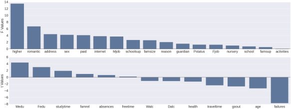
Univariate estimates of variable importance for feature selection

Below, what I’ve done in both languages is to cycle through each variable in the dataset (excepting prior test scores) insert the variable name in a dictionary/list, and get a measure of importance of how predictive that variable is, alone, of the final math test score (variable G3). Of course if the variable is qualitative then I get an F score from an ANOVA, and if it’s quantitative then I get a t score from the regression.

In the case of Python this is achieved in both cases using the ols function from scipy’s statsmodels package. In the case of R I’ve achieved this using the aov function for qualitative and the lm function for quantitative variables. The numerical outcome, as you’ll see from the graphs, is the same.

#Python Code
test_stats = {'variable': [], 'test_type' : [], 'test_value' : []}

for col in mat_perf.columns[:-3]:
    test_stats['variable'].append(col)
    if mat_perf[col].dtype == 'O':
        # Do ANOVA
        aov = smf.ols(formula='G3 ~ C(' + col + ')', data=mat_perf, missing='drop').fit()
        test_stats['test_type'].append('F Test')
        test_stats['test_value'].append(round(aov.fvalue,2))
    else:
        # Do correlation
        print col + '\n'
        model = smf.ols(formula='G3 ~ ' + col, data=mat_perf, missing='drop').fit()
        value = round(model.tvalues[1],2)
        test_stats['test_type'].append('t Test')
        test_stats['test_value'].append(value)

test_stats = DataFrame(test_stats)
test_stats.sort(columns='test_value', ascending=False, inplace=True)
#R Code
test.stats = list(test.type = c(), test.value = c(), variable = c())

for (i in 1:30) {
  test.stats$variable[i] = names(mat_perf)[i]
  if (is.factor(mat_perf[,i])) {
    anova = summary(aov(G3 ~ mat_perf[,i], data=mat_perf))
    test.stats$test.type[i] = "F test"
    test.stats$test.value[i] = unlist(anova)[7]
  }
  else {
    reg = summary(lm(G3 ~ mat_perf[,i], data=mat_perf))
    test.stats$test.type[i] = "t test"
    test.stats$test.value[i] = reg$coefficients[2,3]
  }

}

test.stats.df = arrange(data.frame(test.stats), desc(test.value))
test.stats.df$variable = reorder(test.stats.df$variable, -test.stats.df$test.value)

And now for the graphs. Again you’ll see a bit more code for the Python graph vs the R graph. Perhaps someone will be able to show me code that doesn’t involve as many lines, or maybe it’s just the way things go with graphing in Python. Feel free to educate me 🙂

#Python Code
f, (ax1, ax2) = plt.subplots(2,1, figsize=(48,18), sharex=False)
sns.set_context(context='poster', font_scale=1)
sns.barplot(x='variable', y='test_value', data=test_stats.query("test_type == 'F Test'"), hline=.1, ax=ax1, x_order=[x for x in test_stats.query("test_type == 'F Test'")['variable']])
ax1.set_ylabel('F Values')
ax1.set_xlabel('')

sns.barplot(x='variable', y='test_value', data=test_stats.query("test_type == 't Test'"), hline=.1, ax=ax2, x_order=[x for x in test_stats.query("test_type == 't Test'")['variable']])
ax2.set_ylabel('t Values')
ax2.set_xlabel('')

sns.despine(bottom=True)
plt.tight_layout(h_pad=3)

Python Bar Plot - Univariate Estimates of Variable Importance

#R Code
ggplot(test.stats.df, aes(x=variable, y=test.value)) +
  geom_bar(stat="identity") +
  facet_grid(.~test.type ,  scales="free", space = "free") +
  theme(axis.text.x = element_text(angle = 45, vjust=.75, size=11))

Bar plot - Univariate Estimates of Variable Importance

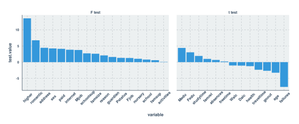
As you can see, the estimates that I generated in both languages were thankfully the same. My next thought was to use only those variables with a test value (F or t) of 3.0 or higher. What you’ll see below is that this led to a pretty severe decrease in predictive power compared to being liberal with feature selection.

In reality, the feature selection I use below shouldn’t be necessary at all given the size of the data set vs the number of predictors, and the statistical method that I’m using to predict grades (random forest). What’s more is that my feature selection method in fact led me to reject certain variables which I later found to be important in my expanded models! For this reason it would be nice to investigate a scalable multivariate feature selection method (I’ve been reading a bit about boruta but am skeptical about how well it scales up) to have in my tool belt. Enough blathering, and on with the model training:

Training the First Random Forest Model

#Python code
usevars =  [x for x in test_stats.query("test_value >= 3.0 | test_value <= -3.0")['variable']]
mat_perf['randu'] = np.array([uniform(0,1) for x in range(0,mat_perf.shape[0])])

mp_X = mat_perf[usevars]
mp_X_train = mp_X[mat_perf['randu'] <= .67]
mp_X_test = mp_X[mat_perf['randu'] > .67]

mp_Y_train = mat_perf.G3[mat_perf['randu'] <= .67]
mp_Y_test = mat_perf.G3[mat_perf['randu'] > .67]

# for the training set
cat_cols = [x for x in mp_X_train.columns if mp_X_train[x].dtype == "O"]
for col in cat_cols:
    new_cols = get_dummies(mp_X_train[col])
    new_cols.columns = col + '_' + new_cols.columns
    mp_X_train = concat([mp_X_train, new_cols], axis=1)

# for the testing set
cat_cols = [x for x in mp_X_test.columns if mp_X_test[x].dtype == "O"]
for col in cat_cols:
    new_cols = get_dummies(mp_X_test[col])
    new_cols.columns = col + '_' + new_cols.columns
    mp_X_test = concat([mp_X_test, new_cols], axis=1)

mp_X_train.drop(cat_cols, inplace=True, axis=1)
mp_X_test.drop(cat_cols, inplace=True, axis=1)

rf = RandomForestRegressor(bootstrap=True,
           criterion='mse', max_depth=2, max_features='auto',
           min_density=None, min_samples_leaf=1, min_samples_split=2,
           n_estimators=100, n_jobs=1, oob_score=True, random_state=None,
           verbose=0)
rf.fit(mp_X_train, mp_Y_train)

After I got past the part where I constructed the training and testing sets (with “unimportant” variables filtered out) I ran into a real annoyance. I learned that categorical variables need to be converted to dummy variables before you do the modeling (where each level of the categorical variable gets its own variable containing 1s and 0s. 1 means that the level was present in that row and 0 means that the level was not present in that row; so called “one-hot encoding”). I suppose you could argue that this puts less computational demand on the modeling procedures, but when you’re dealing with tree based ensembles I think this is a drawback. Let’s say you have a categorical variable with 5 features, “a” through “e”. It just so happens that when you compare a split on that categorical variable where “abc” is on one side and “de” is on the other side, there is a very significant difference in the dependent variable. How is one-hot encoding going to capture that? And then, your dataset which had a certain number of columns now has 5 additional columns due to the encoding. “Blah” I say!

Anyway, as you can see above, I used the get_dummies function in order to do the one-hot encoding. Also, you’ll see that I’ve assigned two thirds of the data to the training set and one third to the testing set. Now let’s see the same steps in R:

#R Code
keep.vars = match(filter(test.stats.df, abs(test.value) >= 3)$variable, names(mat_perf))
ctrl = trainControl(method="repeatedcv", number=10, selectionFunction = "oneSE")
mat_perf$randu = runif(395)
test = mat_perf[mat_perf$randu > .67,]
trf = train(mat_perf[mat_perf$randu <= .67,keep.vars], mat_perf$G3[mat_perf$randu <= .67],
            method="rf", metric="RMSE", data=mat_perf,
            trControl=ctrl, importance=TRUE)

Wait a minute. Did I really just train a Random Forest model in R, do cross validation, and prepare a testing data set with 5 commands!?!? That was a lot easier than doing these preparations and not doing cross validation in Python! I did in fact try to figure out cross validation in sklearn, but then I was having problems accessing variable importances after. I do like the caret package 🙂 Next, let’s see how each of the models did on their testing set:

Testing the First Random Forest Model

#Python Code
y_pred = rf.predict(mp_X_test)
sns.set_context(context='poster', font_scale=1)
first_test = DataFrame({"pred.G3.keepvars" : y_pred, "G3" : mp_Y_test})
sns.lmplot("G3", "pred.G3.keepvars", first_test, size=7, aspect=1.5)
print 'r squared value of', stats.pearsonr(mp_Y_test, y_pred)[0]**2
print 'RMSE of', sqrt(mean_squared_error(mp_Y_test, y_pred))

Python Scatter Plot - First Model Pred vs Actual

R^2 value of 0.104940038879
RMSE of 4.66552400292

Here, as in all cases when making a prediction using sklearn, I use the predict method to generate the predicted values from the model using the testing set and then plot the prediction (“pred.G3.keepvars”) vs the actual values (“G3”) using the lmplot function. I like the syntax that the lmplot function from the seaborn package uses as it is simple and familiar to me from the R world (where the arguments consist of “X variable, Y Variable, dataset name, other aesthetic arguments). As you can see from the graph above and from the R^2 value, this model kind of sucks. Another thing I like here is the quality of the graph that seaborn outputs. It’s nice! It looks pretty modern, the text is very readable, and nothing looks edgy or pixelated in the plot. Okay, now let’s look at the code and output in R, using the same predictors.

#R Code
test$pred.G3.keepvars = predict(trf, test, "raw")
cor.test(test$G3, test$pred.G3.keepvars)$estimate[[1]]^2
summary(lm(test$G3 ~ test$pred.G3.keepvars))$sigma
ggplot(test, aes(x=G3, y=pred.G3.keepvars)) + geom_point() + stat_smooth(method="lm") + scale_y_continuous(breaks=seq(0,20,4), limits=c(0,20))

Scatter Plot - First Model Pred vs Actual

R^2 value of 0.198648
RMSE of 4.148194

Well, it looks like this model sucks a bit less than the Python one. Quality-wise, the plot looks super nice (thanks again, ggplot2 and ggthemr!) although by default the alpha parameter is not set to account for overplotting. The docs page for ggplot2 suggests setting alpha=.05, but for this particular data set, setting it to .5 seems to be better.

Finally for this section, let’s look at the variable importances generated for each training model:

#Python Code
importances = DataFrame({'cols':mp_X_train.columns, 'imps':rf.feature_importances_})
print importances.sort(['imps'], ascending=False)

             cols      imps
3        failures  0.641898
0            Medu  0.064586
10          sex_F  0.043548
19  Mjob_services  0.038347
11          sex_M  0.036798
16   Mjob_at_home  0.036609
2             age  0.032722
1            Fedu  0.029266
15   internet_yes  0.016545
6     romantic_no  0.013024
7    romantic_yes  0.011134
5      higher_yes  0.010598
14    internet_no  0.007603
4       higher_no  0.007431
12        paid_no  0.002508
20   Mjob_teacher  0.002476
13       paid_yes  0.002006
18     Mjob_other  0.001654
17    Mjob_health  0.000515
8       address_R  0.000403
9       address_U  0.000330
#R Code
varImp(trf)

## rf variable importance
## 
##          Overall
## failures 100.000
## romantic  49.247
## higher    27.066
## age       17.799
## Medu      14.941
## internet  12.655
## sex        8.012
## Fedu       7.536
## Mjob       5.883
## paid       1.563
## address    0.000

My first observation is that it was obviously easier for me to get the variable importances in R than it was in Python. Next, you’ll certainly see the symptom of the dummy coding I had to do for the categorical variables. That’s no fun, but we’ll survive through this example analysis, right? Now let’s look which variables made it to the top:

Whereas failures, mother’s education level, sex and mother’s job made it to the top of the list for the Python model, the top 4 were different apart from failures in the R model.

With the understanding that the variable selection method that I used was inappropriate, let’s move on to training a Random Forest model using all predictors except the prior 2 test scores. Since I’ve already commented above on my thoughts about the various steps in the process, I’ll comment only on the differences in results in the remaining sections.

Training and Testing the Second Random Forest Model

#Python Code

#aav = almost all variables
mp_X_aav = mat_perf[mat_perf.columns[0:30]]
mp_X_train_aav = mp_X_aav[mat_perf['randu'] <= .67]
mp_X_test_aav = mp_X_aav[mat_perf['randu'] > .67]

# for the training set
cat_cols = [x for x in mp_X_train_aav.columns if mp_X_train_aav[x].dtype == "O"]
for col in cat_cols:
    new_cols = get_dummies(mp_X_train_aav[col])
    new_cols.columns = col + '_' + new_cols.columns
    mp_X_train_aav = concat([mp_X_train_aav, new_cols], axis=1)
    
# for the testing set
cat_cols = [x for x in mp_X_test_aav.columns if mp_X_test_aav[x].dtype == "O"]
for col in cat_cols:
    new_cols = get_dummies(mp_X_test_aav[col])
    new_cols.columns = col + '_' + new_cols.columns
    mp_X_test_aav = concat([mp_X_test_aav, new_cols], axis=1)

mp_X_train_aav.drop(cat_cols, inplace=True, axis=1)
mp_X_test_aav.drop(cat_cols, inplace=True, axis=1)

rf_aav = RandomForestRegressor(bootstrap=True, 
           criterion='mse', max_depth=2, max_features='auto',
           min_density=None, min_samples_leaf=1, min_samples_split=2,
           n_estimators=100, n_jobs=1, oob_score=True, random_state=None,
           verbose=0)
rf_aav.fit(mp_X_train_aav, mp_Y_train)

y_pred_aav = rf_aav.predict(mp_X_test_aav)
second_test = DataFrame({"pred.G3.almostallvars" : y_pred_aav, "G3" : mp_Y_test})
sns.lmplot("G3", "pred.G3.almostallvars", second_test, size=7, aspect=1.5)
print 'r squared value of', stats.pearsonr(mp_Y_test, y_pred_aav)[0]**2
print 'RMSE of', sqrt(mean_squared_error(mp_Y_test, y_pred_aav))

Python Scatter Plot - Second Model Pred vs Actual

R^2 value of 0.226587731888
RMSE of 4.3338674965

Compared to the first Python model, the R^2 on this one is more than doubly higher (the first R^2 was .10494) and the RMSE is 7.1% lower (the first was 4.6666254). The predicted vs actual plot confirms that the predictions still don’t look fantastic compared to the actuals, which is probably the main reason why the RMSE hasn’t decreased by so much. Now to the R code using the same predictors:

#R code
trf2 = train(mat_perf[mat_perf$randu <= .67,1:30], mat_perf$G3[mat_perf$randu <= .67],
            method="rf", metric="RMSE", data=mat_perf,
            trControl=ctrl, importance=TRUE)
test$pred.g3.almostallvars = predict(trf2, test, "raw")
cor.test(test$G3, test$pred.g3.almostallvars)$estimate[[1]]^2
summary(lm(test$G3 ~ test$pred.g3.almostallvars))$sigma
ggplot(test, aes(x=G3, y=pred.g3.almostallvars)) + geom_point() + 
  stat_smooth() + scale_y_continuous(breaks=seq(0,20,4), limits=c(0,20))

Scatter Plot - Second Model Pred vs Actual

R^2 value of 0.3262093
RMSE of 3.8037318

Compared to the first R model, the R^2 on this one is approximately 1.64 times higher (the first R^2 was .19865) and the RMSE is 8.3% lower (the first was 4.148194). Although this particular model is indeed doing better at predicting values in the test set than the one built in Python using the same variables, I would still hesitate to assume that the process is inherently better for this data set. Due to the randomness inherent in Random Forests, one run of the training could be lucky enough to give results like the above, whereas other times the results might even be slightly worse than what I managed to get in Python. I confirmed this, and in fact most additional runs of this model in R seemed to result in an R^2 of around .20 and an RMSE of around 4.2.

Again, let’s look at the variable importances generated for each training model:

#Python Code
importances_aav = DataFrame({'cols':mp_X_train_aav.columns, 'imps':rf_aav.feature_importances_})
print importances_aav.sort(['imps'], ascending=False)

                 cols      imps
5            failures  0.629985
12           absences  0.057430
1                Medu  0.037081
41      schoolsup_yes  0.036830
0                 age  0.029672
23       Mjob_at_home  0.029642
16              sex_M  0.026949
15              sex_F  0.026052
40       schoolsup_no  0.019097
26      Mjob_services  0.016354
55       romantic_yes  0.014043
51         higher_yes  0.012367
2                Fedu  0.011016
39     guardian_other  0.010715
37    guardian_father  0.006785
8               goout  0.006040
11             health  0.005051
54        romantic_no  0.004113
7            freetime  0.003702
3          traveltime  0.003341
#R Code
varImp(trf2)

## rf variable importance
## 
##   only 20 most important variables shown (out of 30)
## 
##            Overall
## absences    100.00
## failures     70.49
## schoolsup    47.01
## romantic     32.20
## Pstatus      27.39
## goout        26.32
## higher       25.76
## reason       24.02
## guardian     22.32
## address      21.88
## Fedu         20.38
## school       20.07
## traveltime   20.02
## studytime    18.73
## health       18.21
## Mjob         17.29
## paid         15.67
## Dalc         14.93
## activities   13.67
## freetime     12.11

Now in both cases we’re seeing that absences and failures are considered as the top 2 most important variables for predicting final math exam grade. It makes sense to me, but frankly is a little sad that the two most important variables are so negative 😦 On to to the third Random Forest model, containing everything from the second with the addition of the students’ marks on their second math exam!

Training and Testing the Third Random Forest Model

#Python Code

#allv = all variables (except G1)
allvars = range(0,30)
allvars.append(31)
mp_X_allv = mat_perf[mat_perf.columns[allvars]]
mp_X_train_allv = mp_X_allv[mat_perf['randu'] <= .67]
mp_X_test_allv = mp_X_allv[mat_perf['randu'] > .67]

# for the training set
cat_cols = [x for x in mp_X_train_allv.columns if mp_X_train_allv[x].dtype == "O"]
for col in cat_cols:
    new_cols = get_dummies(mp_X_train_allv[col])
    new_cols.columns = col + '_' + new_cols.columns
    mp_X_train_allv = concat([mp_X_train_allv, new_cols], axis=1)
    
# for the testing set
cat_cols = [x for x in mp_X_test_allv.columns if mp_X_test_allv[x].dtype == "O"]
for col in cat_cols:
    new_cols = get_dummies(mp_X_test_allv[col])
    new_cols.columns = col + '_' + new_cols.columns
    mp_X_test_allv = concat([mp_X_test_allv, new_cols], axis=1)

mp_X_train_allv.drop(cat_cols, inplace=True, axis=1)
mp_X_test_allv.drop(cat_cols, inplace=True, axis=1)

rf_allv = RandomForestRegressor(bootstrap=True, 
           criterion='mse', max_depth=2, max_features='auto',
           min_density=None, min_samples_leaf=1, min_samples_split=2,
           n_estimators=100, n_jobs=1, oob_score=True, random_state=None,
           verbose=0)
rf_allv.fit(mp_X_train_allv, mp_Y_train)

y_pred_allv = rf_allv.predict(mp_X_test_allv)
third_test = DataFrame({"pred.G3.plusG2" : y_pred_allv, "G3" : mp_Y_test})
sns.lmplot("G3", "pred.G3.plusG2", third_test, size=7, aspect=1.5)
print 'r squared value of', stats.pearsonr(mp_Y_test, y_pred_allv)[0]**2
print 'RMSE of', sqrt(mean_squared_error(mp_Y_test, y_pred_allv))

Python Scatter Plot - Third Model Pred vs Actual

R^2 value of 0.836089929903
RMSE of 2.11895794845

Obviously we have added a highly predictive piece of information here by adding the grades from their second math exam (variable name was “G2”). I was reluctant to add this variable at first because when you predict test marks with previous test marks then it prevents the model from being useful much earlier on in the year when these tests have not been administered. However, I did want to see what the model would look like when I included it anyway! Now let’s see how predictive these variables were when I put them into a model in R:

#R Code
trf3 = train(mat_perf[mat_perf$randu <= .67,c(1:30,32)], mat_perf$G3[mat_perf$randu <= .67], 
             method="rf", metric="RMSE", data=mat_perf, 
             trControl=ctrl, importance=TRUE)
test$pred.g3.plusG2 = predict(trf3, test, "raw")
cor.test(test$G3, test$pred.g3.plusG2)$estimate[[1]]^2
summary(lm(test$G3 ~ test$pred.g3.plusG2))$sigma
ggplot(test, aes(x=G3, y=pred.g3.plusG2)) + geom_point() + 
  stat_smooth(method="lm") + scale_y_continuous(breaks=seq(0,20,4), limits=c(0,20))

Scatter Plot - Third Model Pred vs Actual

R^2 value of 0.9170506
RMSE of 1.3346087

Well, it appears that yet again we have a case where the R model has fared better than the Python model. I find it notable that when you look at the scatterplot for the Python model you can see what look like steps in the points as you scan your eyes from the bottom-left part of the trend line to the top-right part. It appears that the Random Forest model in R has benefitted from the tuning process and as a result the distribution of the residuals are more homoscedastic and also obviously closer to the regression line than the Python model. I still wonder how much more similar these results would be if I had carried out the Python analysis by tuning while cross validating like I did in R!

For the last time, let’s look at the variable importances generated for each training model:

#Python Code
importances_allv = DataFrame({'cols':mp_X_train_allv.columns, 'imps':rf_allv.feature_importances_})
print importances_allv.sort(['imps'], ascending=False)

                 cols      imps
13                 G2  0.924166
12           absences  0.075834
14          school_GP  0.000000
25        Mjob_health  0.000000
24       Mjob_at_home  0.000000
23          Pstatus_T  0.000000
22          Pstatus_A  0.000000
21        famsize_LE3  0.000000
20        famsize_GT3  0.000000
19          address_U  0.000000
18          address_R  0.000000
17              sex_M  0.000000
16              sex_F  0.000000
15          school_MS  0.000000
56       romantic_yes  0.000000
27      Mjob_services  0.000000
11             health  0.000000
10               Walc  0.000000
9                Dalc  0.000000
8               goout  0.000000
#R Code
varImp(trf3)

## rf variable importance
## 
##   only 20 most important variables shown (out of 31)
## 
##            Overall
## G2         100.000
## absences    33.092
## failures     9.702
## age          8.467
## paid         7.591
## schoolsup    7.385
## Pstatus      6.604
## studytime    5.963
## famrel       5.719
## reason       5.630
## guardian     5.278
## Mjob         5.163
## school       4.905
## activities   4.532
## romantic     4.336
## famsup       4.335
## traveltime   4.173
## Medu         3.540
## Walc         3.278
## higher       3.246

Now this is VERY telling, and gives me insight as to why the scatterplot from the Python model had that staircase quality to it. The R model is taking into account way more variables than the Python model. G2 obviously takes the cake in both models, but I suppose it overshadowed everything else by so much in the Python model, that for some reason it just didn’t find any use for any other variable than absences.

Conclusion

This was fun! For all the work I did in Python, I used IPython Notebook. Being an avid RStudio user, I’m not used to web-browser based interactive coding like what IPython Notebook provides. I discovered that I enjoy it and found it useful for laying out the information that I was using to write this blog post (I also laid out the R part of this analysis in RMarkdown for that same reason). What I did not like about IPython Notebook is that when you close it/shut it down/then later reinitialize it, all of the objects that form your data and analysis are gone and all you have left are the results. You must then re-run all of your code so that your objects are resident in memory again. It would be nice to have some kind of convenience function to save everything to disk so that you can reload at a later time.

I found myself stumbling a lot trying to figure out which Python packages to use for each particular purpose and I tended to get easily frustrated. I had to keep reminding myself that it’s a learning curve to a similar extent as it was for me while I was learning R. This frustration should not be a deterrent from picking it up and learning how to do machine learning in Python. Another part of my frustration was not being able to get variable importances from my Random Forest models in Python when I was building them using cross validation and grid searches. If you have a link to share with me that shows an example of this, I’d be happy to read it.

I liked seaborn and I think if I spend more time with it then perhaps it could serve as a decent alternative to graphing in ggplot2. That being said, I’ve spent so much time using ggplot2 that sometimes I wonder if there is anything out there that rivals its flexibility and elegance!

The issue I mentioned above with categorical variables is annoying and it really makes me wonder if using a Tree based R model would intrinsically be superior due to its automatic handling of categorical variables compared with Python, where you need to one-hot encode these variables.

All in all, I hope this was as useful and educational for you as it was for me. It’s important to step outside of your comfort zone every once in a while 🙂

Predicting Mobile Phone Prices

Recently a colleague of mine showed me a nauseating interactive scatterplot that plots mobile phones according to two dimensions of the user’s choice from a list of possible dimensions.  Although the interactive visualization was offensive to my tastes, the JSON data behind the visualization was intriguing.  It was easy enough to get the data behind it (see this link if you want an up to date copy and be sure to take out the “data=” from the start of the file! I pulled this data around noon on March 23rd.) so that I could start asking a simple question: Which of the available factors provided in the dataset were the most predictive of full mobile phone price?

I’ll present the graphs and then the predictive model first and then the code later on:

Price by OS and Brand:

Often when investigating a topic using data, we confirm things that we already knew to be true.  This is certainly the case here with price by OS and brand.  From the below boxplots we see that the bulk of iOS devices tend to be the most expensive, and that brand-wise Apple, Google, and Samsung seem to stick out.

Mobile Phone Price by Operating System

Mobile Phone Prices by Brand

Price by Storage Capacity, RAM, and SD Card Capacity:

Storage capacity is perhaps the least surprising to find as having such a sharply positive correlation with price. I think what is more surprising to me is that there aren’t more gradations of storage capacity in the higher range past 50 gigabytes.  I’m guessing this is because the bulk of these phones (bearing in mind roughly 90% of these phones are in fact smart phones) are catered towards lower income folks.  Can you guess which phones occupy the top-right-most position on the first graph?  If your answer involved the iPhone 6 then you’re right on two counts!

As you can see, the correlation between RAM and price is pretty linear (with phones costing $171.54 more for each additional gigabyte of RAM) and that between SD Card capacity and price is linear past the large group of phones with 0 SD Card capacity (with phones costing $3.64 more for each additional gigabyte of SD Card Capacity).

Price by Storage Capacity

Price by RAM

Price by SD Card

Price by Screen Size, Battery, and Weight:

The next factors that I think one would naturally think of when considering the price of a mobile phone are all related to how big the thing is. Smart phones these days have a lot of physical presence just by dint of their screen size alone. Add to the large screen size the batteries that are used to support such generous displays and you also get an impressive variety of weights to these phones.

In fact, for every additional inch of screen size to these phones, you can expect an additional .81504 ounces and 565.11 mAh of battery capacity. My own humble little smartphone (an HTC Desire 601) happens to be on the smaller and lighter side of the spectrum as far as screen size and weight goes (4.5 inches screen size, or 33rd percentile; 4.59 ounces or 26th percentile) but happens to have a pretty generous battery capacity all things considered (2100 mAh, or 56th percentile).

While positive correlations can be seen between Price and all these 3 factors, battery was the most correlated with Price, next to screen size and then weight.  There’s obviously a lot of variability in price when you look at the phones with the bigger screen sizes, as they probably tend to come packed with a variety of premium extra features that can be used to jack up the price.

Price by Screen Size

Price by Battery

Price by Weight

Putting it all together in a model:
Finally, let’s lump all of the factors provided in the data set into a model, and see how well it performs on a testing sample. I decided on an 80/20 training/testing split, and am of course using Max Kuhn’s fabulous caret package to do the dirty work. I ran a gbm model, shown below, and managed to get an R squared of 60.4% in the training sample, so not bad.

Stochastic Gradient Boosting 

257 samples
 23 predictors

No pre-processing
Resampling: Cross-Validated (10 fold) 

Summary of sample sizes: 173, 173, 171, 171, 172, 171, ... 

Resampling results across tuning parameters:

  interaction.depth  n.trees  RMSE      Rsquared   RMSE SD   Rsquared SD
  1                   50      150.1219  0.5441107  45.36781  0.1546993  
  1                  100      147.5400  0.5676971  46.03555  0.1528225  
  1                  150      146.3710  0.5803005  45.00296  0.1575795  
  2                   50      144.0657  0.5927624  45.46212  0.1736994  
  2                  100      143.7181  0.6036983  44.80662  0.1787351  
  2                  150      143.4850  0.6041207  45.57357  0.1760428  
  3                   50      148.4914  0.5729182  45.27579  0.1903465  
  3                  100      148.5363  0.5735842  43.41793  0.1746064  
  3                  150      148.8497  0.5785677  43.39338  0.1781990  

Tuning parameter 'shrinkage' was held constant at a value of 0.1
RMSE was used to select the optimal model using  the smallest value.
The final values used for the model were n.trees = 150, interaction.depth = 2 and shrinkage = 0.1.

Now let’s look at the terms that came out as the most significant in the chosen model.  Below we see some unsurprising findings! Storage, battery, weight, RAM, and whether or not the phone uses iOS as the top 5. I guess I’m surprised that screen size was not higher up in the priority list, but at least it got in 6th place!

gbm variable importance

  only 20 most important variables shown (out of 41)

                  Overall
att_storage      100.0000
att_battery_mah   59.7597
att_weight        46.5410
att_ram           27.5871
att_osiOS         26.9977
att_screen_size   21.1106
att_sd_card       20.1130
att_brandSamsung   9.1220

Finally, let’s look at how our model did in the testing sample. Below I’ve shown you a plot of actual versus predicted price values. The straight line is what we would expect to see if there were a perfect correlation between the two (obviously not!!) while the smoothed line is the trend that we actually do see in the scatter plot. Considering the high R squared in the testing sample of 57% (not too far off from the training sample) it’s of course a nice confirmation of the utility of this model to see the smooth line following that perfect prediction line, but I won’t call be calling up Rogers Wireless with the magical model just yet!

Price by Predicted Price

In fact, before I close off this post, it would be remiss of me not to investigate a couple of cases in this final graph that look like outliers. The one on the bottom right, and the one on the top left.

The one on the bottom right happens to be a Sony Xperia Z3v Black with 32GB of storage space. What I learned from checking into this is that since the pricing data on the source website is pulled from amazon.com, sometimes instead of pulling the full regular price, it happens to pull the data on a day when a special sale or service agreement price is listed. When I pulled the data, the Xperia was listed at a price of $29.99. Today, on April 6th, the price that you would get if you looked it up through the source website is .99! Interestingly, my model had predicted a full price of $632.17, which was not very far off from the full price of $599.99 that you can see if you go on the listing on amazon.com. Not bad!

Now, how about the phone that cost so much but that the model said shouldn’t? This phone was none other than the Black LG 3960 Google Nexus 4 Unlocked GSM Phone with 16GB of Storage space. The price I pulled that day was a whopping $699.99 but the model only predicted a price of $241.86! Considering the specs on this phone, the only features that really seem to measure up are the storage (16GB is roughly in the 85th percentile for smart phones) and the RAM (2 GB is roughly in the 93rd percentile for smart phones). Overall though, the model can’t account for any other qualities that Google might have imbued into this phone that were not measured by the source website. Hence, this is a formidable model outlier!

If you take out the Sony Xperia that I mentioned first, the Adjusted R squared value goes up from 57% to 74%, and the Residual Standard Error decreases from $156 to $121. That’s a lot of influence for just one outlier that we found to be based on data quality alone. Wow!

Reflecting on this exercise, the one factor that I wished were collected is processor speed.  I’m curious how much that would factor into pricing decisions, but alas this information was unavailable.

Anyway, this was fun, and I hope not too boring for you, the readers. Thanks for reading!!


library(jsonlite)
cp = fromJSON(txt = "Cell Phone Data.txt", simplifyDataFrame = TRUE)
num.atts = c(4,9,11,12,13,14,15,16,18,22)
cp[,num.atts] = sapply(cp[,num.atts], function (x) as.numeric(x))
cp$aspect.ratio = cp$att_pixels_y / cp$att_pixels_x
cp$isSmartPhone = ifelse(grepl("smart|iphone|blackberry", cp$name, ignore.case=TRUE) == TRUE | cp$att_screen_size >= 4, "Yes", "No")
library(ggplot2)
library(ggthemr)
library(scales)
ggthemr("camoflauge")
ggplot(cp, aes(x=att_brand, y=price)) + geom_boxplot() + ggtitle("Mobile Phone Price by Brand") + theme(axis.text.x=element_text(angle=90, size=14, vjust=0.5), axis.text.y=element_text(size=14), axis.title.x=element_text(size=15), axis.title.y=element_text(size=15), plot.title=element_text(size=17)) + scale_y_continuous(labels=dollar, name="Price (USD?)") + scale_x_discrete("Brand")
ggplot(cp, aes(x=att_weight, y=price)) + geom_point(size=3) + ggtitle("Mobile Phone Price by Weight") + theme(axis.text.x=element_text(size=14, vjust=0.5), axis.text.y=element_text(size=14), axis.title.x=element_text(size=15), axis.title.y=element_text(size=15), plot.title=element_text(size=17)) + scale_y_continuous(labels=dollar, name="Price (USD?)") + scale_x_continuous("Weight (oz)") + stat_smooth(se=FALSE)
ggplot(cp, aes(x=att_screen_size, y=price)) + geom_point(size=3) + ggtitle("Mobile Phone Price by Screen Size") + theme(axis.text.x=element_text(size=14, vjust=0.5), axis.text.y=element_text(size=14), axis.title.x=element_text(size=15), axis.title.y=element_text(size=15), plot.title=element_text(size=17)) + scale_y_continuous(labels=dollar, name="Price (USD?)") + scale_x_continuous("Screen Size (in)") + stat_smooth(se=FALSE)
ggplot(cp, aes(x=att_ram, y=price)) + geom_point(size=3) + ggtitle("Mobile Phone Price by Amount of RAM") + theme(axis.text.x=element_text(size=14, vjust=0.5), axis.text.y=element_text(size=14), axis.title.x=element_text(size=15), axis.title.y=element_text(size=15), plot.title=element_text(size=17)) + scale_y_continuous(labels=dollar, name="Price (USD?)") + scale_x_continuous("RAM (gb)") + stat_smooth(se=FALSE)
ggplot(cp, aes(x=att_sd_card, y=price)) + geom_point(size=3) + ggtitle("Mobile Phone Price by SD Card Capacity") + theme(axis.text.x=element_text(size=14, vjust=0.5), axis.text.y=element_text(size=14), axis.title.x=element_text(size=15), axis.title.y=element_text(size=15), plot.title=element_text(size=17)) + scale_y_continuous(labels=dollar, name="Price (USD?)") + scale_x_continuous("SD Card Capacity (gb)") + stat_smooth(se=FALSE)
ggplot(cp, aes(x=ifelse(cp$att_dual_sim == 1, "Yes", "No"), y=price)) + geom_boxplot() + ggtitle("Mobile Phone Price by Dual Sim") + theme(axis.text.x=element_text(size=14, vjust=0.5), axis.text.y=element_text(size=14), axis.title.x=element_text(size=15), axis.title.y=element_text(size=15), plot.title=element_text(size=17)) + scale_y_continuous(labels=dollar, name="Price (USD?)") + scale_x_discrete("Has Dual Sim Card?")
ggplot(cp, aes(x=att_storage, y=price)) + geom_point(size=3) + ggtitle("Mobile Phone Price by Storage Capacity") + theme(axis.text.x=element_text(size=14, vjust=0.5), axis.text.y=element_text(size=14), axis.title.x=element_text(size=15), axis.title.y=element_text(size=15), plot.title=element_text(size=17)) + scale_y_continuous(labels=dollar, name="Price (USD?)") + scale_x_continuous("Storage Capacity (gb)") + stat_smooth(se=FALSE)
ggplot(cp, aes(x=att_battery_mah, y=price)) + geom_point(size=3) + ggtitle("Mobile Phone Price by Battery Capacity") + theme(axis.text.x=element_text(size=14, vjust=0.5), axis.text.y=element_text(size=14), axis.title.x=element_text(size=15), axis.title.y=element_text(size=15), plot.title=element_text(size=17)) + scale_y_continuous(labels=dollar, name="Price (USD?)") + scale_x_continuous("Battery Capacity (mAh)") + stat_smooth(se=FALSE)
ggplot(cp, aes(x=aspect.ratio, y=price)) + geom_point(size=3) + ggtitle("Mobile Phone Price by Aspect Ratio") + theme(axis.text.x=element_text(size=14, vjust=0.5), axis.text.y=element_text(size=14), axis.title.x=element_text(size=15), axis.title.y=element_text(size=15), plot.title=element_text(size=17)) + scale_y_continuous(labels=dollar, name="Price (USD?)") + scale_x_continuous("Aspect Ratio (Y Pixels / X Pixels)") + stat_smooth(se=FALSE)
ggplot(cp, aes(x=isSmartPhone, y=price)) + geom_boxplot() + ggtitle("Mobile Phone Price by Smart Phone Status") + theme(axis.text.x=element_text(size=14, vjust=0.5), axis.text.y=element_text(size=14), axis.title.x=element_text(size=15), axis.title.y=element_text(size=15), plot.title=element_text(size=17)) + scale_y_continuous(labels=dollar, name="Price (USD?)") + scale_x_discrete("Is it a Smart Phone?")
ggplot(cp, aes(x=att_os, y=price)) + geom_boxplot() + ggtitle("Mobile Phone Price by Operating System") + theme(axis.text.x=element_text(size=14, vjust=0.5), axis.text.y=element_text(size=14), axis.title.x=element_text(size=15), axis.title.y=element_text(size=15), plot.title=element_text(size=17)) + scale_y_continuous(labels=dollar, name="Price (USD?)") + scale_x_discrete("Operating System")
library(caret)
control = trainControl(method="cv")
in_train = createDataPartition(cp$price, p=.8, list=FALSE)
model.gbm = train(price ~ att_brand + att_weight + att_screen_size +
att_ram + att_sd_card + att_dual_sim +
att_storage + att_battery_mah + att_os, data=cp,
method="gbm", trControl=control, verbose=FALSE, subset=in_train)
cp$att_brand = factor(cp$)
cp.test = cp[-in_train,]
cp.test = subset(cp.test, att_brand != 'TOTO')
cp.test = na.omit(cp.test)
cp.test$pred.price = predict(model.gbm, cp.test)
ggplot(cp.test, aes(x=pred.price, y=price)) + geom_point(size=3) + ggtitle("Mobile Phone Price by Predicted Price") + theme(axis.text.x=element_text(size=14, vjust=0.5), axis.text.y=element_text(size=14), axis.title.x=element_text(size=15), axis.title.y=element_text(size=15), plot.title=element_text(size=17)) + scale_y_continuous(labels=dollar, name="Price (USD?)") + scale_x_continuous("Predicted Price", labels=dollar) + geom_abline(intercept=0, slope=1, colour="yellow") + stat_smooth(se=FALSE)

Contraceptive Choice in Indonesia

I wanted yet another opportunity to get to use the fabulous caret package, but also to finally give plot.ly a try.  To scratch both itches, I dipped into the UCI machine learning library yet again and came up with a survey data set on the topic of contraceptive choice in Indonesia.  This was an interesting opportunity for me to learn about a far-off place while practicing some fun data skills.

According to recent estimates, Indonesia is home to some 250 million individuals and over the years, thanks to government intervention, has had its fertility rate slowed down from well over 5 births per woman, to a current value of under 2.4 births per woman.  Despite this slow down, Indonesia is not generating enough jobs to satisfy the population.  Almost a fifth of their youth labour force (aged 15-24) are unemployed (19.6%), a whole 6.3% more than a recent estimate of the youth unemployment rate in Canada (13.3%).  When you’re talking about a country with 250 million individuals (with approximately 43.4 million 15-24 year olds), that’s the difference between about 5.8 million unemployed and 8.5 million unemployed teenagers/young adults.  The very idea is frightening!  Hence the government’s focus (decades ago and now) on promoting contraceptive method use to its population.

That is the spirit behind the survey data we’ll look at today!  First, download the data from my plot.ly account and load it into R.

library(plotly)
library(caret)
library(dplyr)
library(reshape2)
library(scales)

cmc = read.csv("cmc.csv", colClasses = c(Wife.Edu = "factor", Husband.Edu = "factor", Wife.Religion = "factor", 
                                         Wife.Working = "factor", Husband.Occu = "factor", Std.of.Living = "factor",
                                         Media.Exposure = "factor", Contraceptive.Method.Used = "factor"))

levels(cmc$Contraceptive.Method.Used) = c("None","Short-Term","Long-Term")

table(cmc$Contraceptive.Method.Used)
      None Short-Term  Long-Term 
       629        333        511 

prop.table(table(cmc$Contraceptive.Method.Used))

      None Short-Term  Long-Term 
 0.4270197  0.2260692  0.3469111 

Everything in this data set is stored as a number, so the first thing I do is to define as factors what the documentation suggests are factors.  Then, we see the numeric breakdown of how many women fell into each contraceptive method category.  It’s 1473 responses overall, and ‘None’ is the largest category, although it is not hugely different from the others (although a chi squared test does tell me that the proportions are significantly different from one another).

Next up, let’s set up the cross validation and training vs testing indices, then train a bunch of models, use a testing sample to compare performance, and then we’ll see some graphs

# It's training time!
control = trainControl(method = "cv")
in_train = createDataPartition(cmc$Contraceptive.Method.Used, p=.75, list=FALSE)

contraceptive.model = train(Contraceptive.Method.Used ~ ., data=cmc, method="rf", metric="Kappa",
                            trControl=control, subset=in_train)

contraceptive.model.gbm = train(Contraceptive.Method.Used ~ ., data=cmc, method="gbm", metric="Kappa",
                            trControl=control, subset=in_train, verbose=FALSE)

contraceptive.model.svm = train(Contraceptive.Method.Used ~ ., data=cmc, method="svmRadial", metric="Kappa",
                                preProc = c('center','scale'), trControl=control, subset=in_train)

contraceptive.model.c50 = train(Contraceptive.Method.Used ~ ., data=cmc, method="C5.0", metric="Kappa",
                                trControl=control, subset=in_train, verbose=FALSE)


dec = expand.grid(.decay=c(0,.0001,.01,.05,.10))
control.mreg = trainControl(method = "cv")
contraceptive.model.mreg = train(Contraceptive.Method.Used ~ ., data=cmc, method="multinom", metric="Kappa",
                                  trControl=control.mreg, tuneGrid = dec, subset=in_train, verbose=FALSE)

# And now it's testing time...
cmc.test = cmc[-in_train,]

cmc.test = cmc.test %>% mutate(
  rf.class = predict(contraceptive.model, cmc.test, type="raw"),
  gbm.class = predict(contraceptive.model.gbm, cmc.test, type="raw"),
  svm.class = predict(contraceptive.model.svm, cmc.test, type="raw"),
  mreg.class = predict(contraceptive.model.mreg, cmc.test, type="raw"),
  c50.class = predict(contraceptive.model.c50, cmc.test, type="raw"))

# Here I'm setting up a matrix to host some performance statistics from each of the models
cmatrix.metrics = data.frame(model = c("rf", "gbm", "svm", "mreg","c50"), kappa = rep(NA,5), sensitivity1 = rep(NA,5), sensitivity2 = rep(NA,5), sensitivity3 = rep(NA,5), specificity1 = rep(NA,5), specificity2 = rep(NA,5), specificity3 = rep(NA,5))

# For each of the models, I use confusionMatrix to give me the performance statistics that I want
for (i in 11:15) {
  cmatrix.metrics[i-10,"kappa"] = confusionMatrix(cmc.test$Contraceptive.Method.Used, cmc.test[,i])$overall[2][[1]]
  cmatrix.metrics[i-10, "sensitivity1"] = confusionMatrix(cmc.test$Contraceptive.Method.Used, cmc.test[,i])$byClass[1,1]
  cmatrix.metrics[i-10, "sensitivity2"] = confusionMatrix(cmc.test$Contraceptive.Method.Used, cmc.test[,i])$byClass[2,1]
  cmatrix.metrics[i-10, "sensitivity3"] = confusionMatrix(cmc.test$Contraceptive.Method.Used, cmc.test[,i])$byClass[3,1]
  cmatrix.metrics[i-10, "specificity1"] = confusionMatrix(cmc.test$Contraceptive.Method.Used, cmc.test[,i])$byClass[1,2]
  cmatrix.metrics[i-10, "specificity2"] = confusionMatrix(cmc.test$Contraceptive.Method.Used, cmc.test[,i])$byClass[2,2]
  cmatrix.metrics[i-10, "specificity3"] = confusionMatrix(cmc.test$Contraceptive.Method.Used, cmc.test[,i])$byClass[3,2]
}

# Now I transform my cmatrix.metrics matrix into a long format suitable for ggplot, graph it, and then post it to plot.ly

cmatrix.long = melt(cmatrix.metrics, id.vars=1, measure.vars=c(2:8))

ggplot(cmatrix.long, aes(x=model, y=value)) + geom_point(stat="identity", colour="blue", size=3) + facet_grid(~variable) + theme(axis.text.x=element_text(angle=90,vjust=0.5, colour="black",size=12), axis.text.y=element_text(colour="black", size=12), strip.text=element_text(size=12), axis.title.x=element_text(size=14,face="bold"), axis.title.y=element_text(size=14, face="bold")) + ggtitle("Performance Stats for Contraceptive Choice Models") + scale_x_discrete("Model") + scale_y_continuous("Value")

set_credentials_file("my.username","my.password")
py = plotly()
py$ggplotly()

And behold the beautiful graph (after some tinkering in the plot.ly interface, of course)

performance_stats_for_contraceptive_choice_modelsPlease note, the 1/2/3 next to sensitivity and specificity refer to the contraceptive use classes, ‘None’, ‘Short-term’, ‘Long-term’.

Firstly, the kappa stats are telling us that after you factor into accuracy the results you would expect by chance, the models don’t add a humongous level of predictive power.  So, we won’t collect our nobel prize on this one!  The classes are evidently more difficult to positively identify than they are to negatively identify, as evidenced by the lower sensitivity scores than specificity scores.  Interestingly, class 1 (users of NO contraceptive methods) was the most positively identifiable.

Secondly, it looks like we have a list of the top 3 performers in terms of kappa, sensitivity and specificity (in no particular order because I they don’t appear that different):

  • gbm (gradient boosting machine)
  • svm (support vector machine)
  • c50

Now that we have a subset of models, let’s see what they have to say about variable importance.  Once we see what they have to say, we’ll do some more fun graphing to see the variables in action.

gbm.imp = varImp(contraceptive.model.gbm)
svm.imp = varImp(contraceptive.model.svm)
c50.imp = varImp(contraceptive.model.c50)

I haven’t used ggplot here because I decided to try copy pasting the tables directly into plot.ly for the heck of it. Let’s have a look at variable importance according to the three models now:

contraceptive_choice_model_-_gbm_variable_importance

contraceptive_choice_model_-_c50_variable_importance

contraceptive_method_model_-_svm_variable_importanceOne commonality that you see throughout all of these graphs is that the wife’s age, her education, and the number of children born to her are among the most predictive in terms of classifying where she will fall on the contraceptive choice spectrum provided in the survey.  Given that result, let’s see some graphs that plot contraceptive choice against the aforementioned 3 predictive variables:

plot(Contraceptive.Method.Used ~ Wife.Age, data=cmc, main="Contraceptive Method Used According to Age of Wife")

cmethod.by.kids = melt(dcast(cmc, Num.Kids ~ Contraceptive.Method.Used, value.var="Contraceptive.Method.Used", fun.aggregate=length), id.vars=1,measure.vars=c(2:4), variable.name="Contraceptive.Method.Used", value.name="Num.Records")

ggplot(cmethod.by.kids, aes(x=Num.Kids, y=Num.Records, fill=Contraceptive.Method.Used)) + geom_bar(position="fill", stat="identity") + scale_y_continuous(labels=percent) + ggtitle("Contraceptive Choice by Number of Kids")
ggplot(cmethod.by.kids, aes(x=Num.Kids, y=Num.Records, fill=Contraceptive.Method.Used)) + geom_bar(stat="identity") + ggtitle("Contraceptive Choice by Number of Kids")

cmethod.by.wife.edu = melt(dcast(cmc, Wife.Edu ~ Contraceptive.Method.Used, value.var="Contraceptive.Method.Used", fun.aggregate=length), id.vars=1,measure.vars=c(2:4), variable.name="Contraceptive.Method.Used", value.name="Num.Records")

ggplot(cmethod.by.wife.edu, aes(x=Wife.Edu, y=Num.Records, fill=Contraceptive.Method.Used)) + geom_bar(position="fill", stat="identity") + scale_y_continuous(labels=percent) + ggtitle("Contraceptive Choice by Education Level of Wife")
ggplot(cmethod.by.wife.edu, aes(x=Wife.Edu, y=Num.Records, fill=Contraceptive.Method.Used)) + geom_bar(stat="identity") + ggtitle("Contraceptive Choice by Education Level of Wife")

And now the graphs:

Contraceptive Choice by Age of Wife

Okay so this isn’t a plotly graph, but I do rather like the way this mosaic plot conveys the information.  The insight here is after a certain age (around age 36) the women seem to be less inclined to report the use of long-term contraceptive methods, and more inclined to report no contraceptive use at all.  Could it be that the older women feel that they are done with child bearing, and so do not feel the need for contraception anymore?  Perhaps someone more knowledgeable on the matter could enlighten me!

contraceptive_choice_by_education_level_of_wife

contraceptive_choice_by_education_level_of_wife prop

Here’s a neat one, showing us the perhaps not-so-revelatory result that as the education level of the wife increases, the likelihood that she will report no contraception diminishes.  Here it is in fact the short term contraceptive methods where we see the biggest increase in likelihood as the education level increases.  I don’t think you can cite education in and of itself that causes women to choose contraception, because perhaps it’s higher socio-economic status which leads them to pursue higher education which leads them to choose contraception.  I’m not sure this survey will answer that question, however!

contraceptive_choice_by_number_of_kids

contraceptive_choice_by_number_of_kids prop

Finally, we have number of kids, which exhibits an odd relationship with contraceptive choice. It appears as though at least half of the women with 1 child reported no contraception, but that proportion goes down when you look at women with 3 children.  After that, women are more and more likely to cite no contraception, likely reflecting their age.

Conclusion and observations:

As I mentioned earlier, I don’t expect to pick up any nobel prizes from this analysis.  Substantively, the most interesting thing that came out of this analysis for me is that it was stage of life factors (# kids and age) in addition to the wife’s education (and possibly income, but that wasn’t measured) which formed the most predictive variables in the classification of who uses which contraceptive methods.  Naively, I expected wife’s religion to be amongst the most predictive.

According to UNICEF, 6/10 drop-outs in primary school are girls.  That increases to 7/10 in secondary school.  Stop that trend from happening, and then who knows what improvements might result?  Perhaps continuing to invest in girls’ education will help lay the foundation for the later pursuit of higher education and the slowing down of their population expansion.

Lastly, I have some comments about plotly:

  1. It was a big buzz kill to discover that I couldn’t embed my plotly plots into my wordpress blog.  Bummer.
  2. The plots that did result were very nice looking!
  3. I found myself getting impatient figuring out where to click to customize my plots to my liking.  There’s something about going from a command line to a gui which is odd for me!
  4. I initially thought it was cool that I could save a theme for my plot once I customized it to my liking.  I was disappointed to learn that the theme was not saved as an absolute set of visual characteristics.  For some reason those characteristics changed depending on the initial graph I imported from R and I could not just apply it and be done with it.
  5. I found myself wondering if I there was a better way of getting my R graphs into plotly than the proscribed py$ggplotly() method.  It’s not my biggest complaint, but somehow I’d rather just have one command to batch upload all of my graphs.

I’ll be watching plotly as it evolves and hope to see it improve even more than it has already!  Good luck!

Predictive modelling fun with the caret package

I’m back!  6 months after my second child was born, I’ve finally made it back to my blog with something fun to write about.  I recently read through the excellent Machine Learning with R ebook and was impressed by the caret package and how easy it made it seem to do predictive modelling that was a little more than just the basics.

With that in mind, I went searching through the UCI machine learning repository and found a dataset about leaves that looked promising for a classification problem.  The dataset comprises of leaves from almost 40 different plant species, and has 14 numerical attributes describing each leaf.  It comes with a pdf file that shows pretty pictures of each leaf for the botanists out there, and some very mathematics heavy descriptions of each of the attributes which I couldn’t even hope to understand with my lack of education on the matter!

Seeing that it didn’t look overly complex to process, I decided to load it in and set up the overall training parameters:

library(caret)
leaf = read.csv("leaf.csv", colClasses = c(Class = "factor"))
ctrl = trainControl(method="repeatedcv", number=10, repeats=5, selectionFunction = "oneSE")
in_train = createDataPartition(leaf$Class, p=.75, list=FALSE)

First, I made sure that the Class variable remained a factor, even though it’s coded with integers in the incoming data.  This way once I split the data into a test set, I won’t get any complaints about missing outcome values if the sampling doesn’t pick up one of those values!

You’ll notice I’ve tried repeated cross validation here, with 5 repeats, and have used the ‘oneSE’ selection function.  This ensures that for whichever model I choose, the model gets tested on 10 different parts of my data, repeated 5 times over, and then I’ve chosen the ‘oneSE’ function to hopefully select a model that is not the most complex.  Finally, I use createDataPartition to create a a training sample of 75% of the data.

trf = train(Class ~ Eccentricity + Aspect_Ratio + Elongation +
              Solidity + Stoch_Convexity + Isoperimetric + 
              Max_Ind_Depth + Lobedness + Avg_Intensity + 
              Avg_Contrast + Smoothness + Third_Moment + 
              Uniformity + Entropy, data=leaf, method="rf", metric="Kappa",
            trControl=ctrl, subset = in_train)

tgbm = train(Class ~ Eccentricity + Aspect_Ratio + Elongation +
              Solidity + Stoch_Convexity + Isoperimetric + 
              Max_Ind_Depth + Lobedness + Avg_Intensity + 
              Avg_Contrast + Smoothness + Third_Moment + 
              Uniformity + Entropy, data=leaf, method="gbm", metric="Kappa",
            trControl=ctrl, subset = in_train, verbose=FALSE)

I’ve chosen to use a random forest and a generalized boosted model to try to model leaf class.  Notice how I’ve referred to the training parameters in the trControl argument, and have selected the training subset by referring to in_train.  Also, the ‘verbose=FALSE’ argument in the gbm model is important!!  Let’s look at results:

For the trf model:

Random Forest
340 samples
15 predictors
30 classes: '1', '10', '11', '12', '13', '14', '15', '2', '22', '23', '24', '25', '26', '27', '28', '29', '3', '30', '31', '32', '33', '34', '35', '36', '4', '5', '6', '7', '8', '9'

No pre-processing
Resampling: Cross-Validated (10 fold, repeated 5 times)

Summary of sample sizes: 228, 231, 233, 233, 232, 229, ...

Resampling results across tuning parameters:

mtry Accuracy Kappa Accuracy SD Kappa SD
2 0.7341953 0.7230754 0.07930583 0.08252806
8 0.7513803 0.7409347 0.08873493 0.09237854
14 0.7481404 0.7375215 0.08438226 0.08786254

Kappa was used to select the optimal model using the one
SE rule.
The final value used for the model was mtry = 8.

So as you can see it’s selected a random forest model that tries 8 random predictors at each split, and it seems to be doing pretty well with a Kappa of .74. Now let’s move on to the next results:

For the tgbm model:

Stochastic Gradient Boosting 

340 samples
 15 predictors
 30 classes: '1', '10', '11', '12', '13', '14', '15', '2', '22', '23', '24', '25', '26', '27', '28', '29', '3', '30', '31', '32', '33', '34', '35', '36', '4', '5', '6', '7', '8', '9' 

No pre-processing
Resampling: Cross-Validated (10 fold, repeated 5 times) 

Summary of sample sizes: 226, 231, 229, 231, 228, 231, ... 

Resampling results across tuning parameters:

  interaction.depth  n.trees  Accuracy   Kappa      Accuracy SD  Kappa SD  
  1                   50      0.6550713  0.6406862  0.07735511   0.08017461
  1                  100      0.6779153  0.6646128  0.07461615   0.07739666
  1                  150      0.6799633  0.6667613  0.08291638   0.08592416
  2                   50      0.7000791  0.6876577  0.08467911   0.08771728
  2                  100      0.6984858  0.6860858  0.08711523   0.09041647
  2                  150      0.6886874  0.6759011  0.09157694   0.09494201
  3                   50      0.6838721  0.6708396  0.08850382   0.09166051
  3                  100      0.6992044  0.6868055  0.08423577   0.08714577
  3                  150      0.6976292  0.6851841  0.08414035   0.08693979

Tuning parameter 'shrinkage' was held constant at a value of 0.1
Kappa was used to select the optimal model using  the one SE rule.
The final values used for the model were n.trees = 50, interaction.depth = 2 and shrinkage = 0.1.

Here we see that it has chosen a gbm model with an interaction depth of 2 and 50 trees. This has a kappa of .69, which appears somewhat worse than the random forest model. Let’s do a direct comparison:

resampls = resamples(list(RF = trf,
                          GBM = tgbm))

difValues = diff(resampls)
summary(difValues)

Call:
summary.diff.resamples(object = difValues)

p-value adjustment: bonferroni 
Upper diagonal: estimates of the difference
Lower diagonal: p-value for H0: difference = 0

Accuracy 
    RF        GBM    
RF            0.05989
GBM 0.0003241        

Kappa 
    RF        GBM    
RF            0.06229
GBM 0.0003208  

Sure enough, the difference is statistically significant. The GBM value ends up being less accurate than the random forest model. Now let’s go to the testing stage! You’ll notice I’ve now stuck with the random forest model.

test = leaf[-in_train,]
test$pred.leaf.rf = predict(trf, test, "raw")
confusionMatrix(test$pred.leaf.rf, test$Class)

...
Overall Statistics
                                         
               Accuracy : 0.7381         
                 95% CI : (0.6307, 0.828)
    No Information Rate : 0.0833         
    P-Value [Acc > NIR] : < 2.2e-16      
                                         
                  Kappa : 0.7277         
 Mcnemar's Test P-Value : NA      
...

Please excuse the ellipses above as the confusionMatrix command generates voluminous output! Anyway, sure enough the Kappa statistic was not that far off in the test sample as it was from the training sample (recall it was .74). Also of interest to me (perhaps it’s boring to you!) is the No Information Rate. Allow me to explain: If I take all of the known classes in the testing sample, and just randomly guess which records to which they belong, I will probably get some right. And this is exactly what the No Information Rate is; the proportion of classes that you would guess right if you randomly allocated them. Obviously an accuracy of .74 and a Kappa of .73 are way higher than the No Information Rate, and so I’m happy that the model is doing more than just making lucky guesses!

Finally, caret has a function to calculate variable importance so that you can see which variables were the most informative in making distinctions between classes.  The results for the random forest model follow:

varImp(trf, scale=FALSE)
rf variable importance

                Overall
Solidity         31.818
Aspect_Ratio     26.497
Eccentricity     23.300
Elongation       23.231
Isoperimetric    20.001
Entropy          18.064
Lobedness        15.608
Max_Ind_Depth    14.828
Uniformity       14.092
Third_Moment     13.148
Stoch_Convexity  12.810
Avg_Intensity    12.438
Smoothness       10.576
Avg_Contrast      9.481

As I have very little clue what these variables mean from their descriptions, someone much wiser than me in all things botanical would have to chime in and educate me.

Well, that was good fun! If you have any ideas to keep the good times rolling and get even better results, please chime in by commenting 🙂

Data Until I Die: My blog title and statement of values

When I started keeping this Blog, my intent was to write about and keep helpful snippets of R code that I used in the line of work.  It was the start of my second job after grad school and I was really excited about getting to use R on a regular basis outside of academia!  Well, time went on and so did the number of posts I put on here.  After a while the posts related to work started to dip considerably.  Then, I found my third post grad-school job, which shifted the things I needed R for at work.  I still use R at work, but not for exactly the same things.

After I got my third job, I noticed that all my blog posts were for fun, and not for work.  That’s when I fiddled a little bit with my blog title to incorporate the concept of ‘fun’ in there.  Now that I’ve carried on these ‘for fun’ analyses which I’ve been posting every 1-2 months, I realize that it’s an obsession of mine that’s not going away.  Data, I realize, is a need of mine (probably more than sex, to be honest).  I work with data in the office, I play with data when I can find fun data sets every once in a while at home.

Data and data analysis are comfortably things that I can see myself doing for the rest of my life.  That’s why I decided to call this blog “Data Until I Die!”.  Sometimes I’ll post boring analyses, and sometimes I’ll post really interesting analyses.  The main thing is, this Blog is a good excuse to fuel my Data drive 🙂

Thanks for reading!

Ontario First Nations Libraries Compared Using Ontario Open Data

I recently downloaded a very cool dataset on Ontario libraries from the Ontario Open Data Catalogue.  The dataset contains 142 columns of information describing 386 libraries in Ontario, representing a fantastically massive data collection effort for such important cultural institutions (although the most recent information available is as of 2010).  One column which particularly caught my interest was “Library Service Type”, which breaks the libraries down into:

  • Public or Union Library (247)
  • LSB Library (4)
  • First Nations Library (43)
  • County, County co-operative or Regional Municipality Library (13)
  • Contracting Municipality (49)
  • Contracting LSB (14)

I saw the First Nations Library type and thought it would be really educational for me to compare First Nations libraries against all the other library types combined and see how they compare based on some interesting indicators.  To make these comparisons in this post, I use a few violin plots; where you see more bulkiness in the plot, it tells you that the value on the y axis is more likely for a library compared to the thinner parts.

Our first comparison, shown below, reveals that local population sizes are a LOT more variable amongst the “Other” library types compared to First Nations libraries.  From first to third quartile, First Nations libraries tend to have around 250 to 850 local residents, whereas Other libraries tend to have around 1,110 to 18,530 local residents!

Local Population Sizes by Library Type
_

             isFN.Library 0%    25%  50%   75%    100%
1         Other Libraries 28 1113.5 5079 18529 2773000
2 First Nations Libraries 55  254.5  421   857   11297

Considering the huge difference in the population sizes that these libraries were made to serve, comparisons between library types need to be weighted according to those sizes, so that the comparisons are made proportionate.  In that spirit, the next plot compares the distribution of the number of cardholders per resident by library type.  Thinking about this metric for a moment, it’s possible that a person not living in the neighbourhood of the library can get a card there.  If all the residents of the library’s neighbourhood have a card, and there are people outside of that neighbourhood with cards, then a library could have over 1 cardholder per resident.

Looking at the plot, a couple of things become apparent: Firstly, First Nations libraries appear more likely to to be overloaded with cardholders (more cardholders than there are local residents, 14% of First Nations libraries, vs. 4% of Other libraries).  On the lower end of the spectrum, First Nations libraries show a slight (non-significant) tendency of having fewer cardholders per resident than Other libraries.

Cardholders per Resident by Library Type_

             isFN.Library 0%  25%  50%  75% 100%
1         Other Libraries  0 0.20 0.37 0.55  2.1
2 First Nations Libraries  0 0.19 0.32 0.77  2.8

Next we’ll look at a very interesting metric, because it looks so different when you compare it in its raw form to when you compare it in proportion to population size.  The plot below shows the distribution of English titles in circulation by library type.  It shouldn’t be too surprising that Other libraries, serving population sizes ranging from small to VERY large, also vary quite widely in the number of English titles in circulation (ranging from around 5,600 to 55,000, from first to third quartile).  On the other hand we have First Nations libraries, serving smaller population sizes, varying a lot less in this regard (from around 1,500 to 5,600 from first to third quartile).
Num English Titles in Circulation by Library Type
_

             isFN.Library 0%    25%   50%   75%   100%
1         Other Libraries  0 5637.5 21054 54879 924635
2 First Nations Libraries  0 1500.0  3800  5650  25180

Although the above perspective reveals that First Nations libraries tend to have considerably fewer English titles in circulation, things look pretty different when you weight this metric by the local population size.  Here, the plot for First Nations libraries looks very much like a Hershey’s Kiss, whereas the Other libraries plot looks a bit like a toilet plunger.  In other words, First Nations libraries tend to have more English titles in circulation per resident than Other libraries.  This doesn’t say anything about the quality of those books available in First Nations libraries.  For that reason, it would be nice to have a measure even as simple as median/average age/copyright date of the books in the libraries to serve as a rough proxy for the quality of the books sitting in each library.  That way, we’d know whether the books in these libraries are up to date, or antiquated.
English Titles in Circulation per Resident by Library Type
_

             isFN.Library 0%       25%      50%       75%      100%
1         Other Libraries  0 0.9245169 2.698802  5.179767 119.61462
2 First Nations Libraries  0 2.0614922 7.436399 13.387416  51.14423

For the next plot, I took all of the “per-person” values, and normed them.  That is to say, for any given value on the variables represented below, I subtracted from that value the minimum possible value, and then divided the result by the range of values on that measure.  Thus, any and all values close to 1 are the higher values, and those closer to 0 are the lower values.  I then took the median value (by library type) for each measure, and plotted below.  Expressed this way, flawed though it may be, we see that First Nations Libraries tend to spend more money per local resident, across areas, than Other libraries.  The revenue side looks a bit different.  While they tend to get more revenue per local resident, they appear to generate less self-generated revenue, get fewer donations, and get less money in local operating grants, all in proportion to the number of local residents.  The three areas where they are excelling (again, this is a median measure) are total operating revenue, provincial operating funding, and especially project grants.
Normed Costs and Revenues by Library Type
Here I decided to zero in on the distributional differences in net profit per resident by library type.  Considering that libraries are non-profit institutions, you would expect to see something similar to the plot shown for “Other” libraries, where the overwhelming majority are at or around the zero line.  It’s interesting to me then, especially since I work with non-profit institutions, to see the crazy variability in the First Nations libraries plot.  The upper end of this appears to be from some outrageously high outliers, so I decided to take them out and replot.
Net Profit per Resident Population
In the plot below, I’ve effectively zoomed in, and can see that there do seem to be more libraries showing a net loss, per person, than those in the net gain status.
Normed Costs and Revenues by Library Type - Zoomed In
_

             isFN.Library      0%    25%   50%  75%   100%
1         Other Libraries -149.87  -0.49  0.00 1.16  34.35
2 First Nations Libraries  -76.55 -17.09 -0.88 0.40 250.54

I wanted to see this net profit per person measure mapped out across Ontario, so I used the wonderful ggmap package, which to my delight is Canadian friendly!  Go Canada!  In this first map, we see that First Nations libraries in Southern Ontario (the part of Ontario that looks like the head of a dragon) seem to be “okay” on this measure, with one library at the “neck” of the dragon seeming to take on a little more red of a shade, one further west taking on a very bright green, and a few closer to Manitoba appearing to be the worst.

Net Profit per Local Resident Amongst First Nations LibrariesTo provide more visual clarity on these poorly performing libraries, I took away all libraries at or above zero on this measure.  Now there are fewer distractions, and it’s easier to see the worst performers.

Net Profit per Local Resident Amongst First Nations Libraries - in the red

Finally, as a sanity check, I re-expressed the above measure into a ratio of total operating revenue to total operating expenditure to see if the resulting geographical pattern was similar enough.  Anything taking on a value of less than 1 is spending more than they are making in revenue, and are thus “in the red”.  While there are some differences in how the colours are arrayed across Ontario, the result is largely the same.Operating Revenue to Cost Ratio Amongst First Nations Libraries

Finally, I have one last graph that does seem to show a good-news story.  When I looked at the ratio of annual program attendance to local population size, I found that First Nations libraries seem to attract more people every year, proportionate to population size, compared to Other libraries!  This might have something to do with the draw of a cultural institution in a small community, but feel free to tell me some first hand stories either running against this result, or confirming it if you will:

Annual Program Attendance by Library Type

_

             
          isFN.Library    0%   25%   50%   75%   100%
1         Other Libraries  0 0.018 0.155 0.307  8.8017
2 First Nations Libraries  0 0.113 0.357 2.686  21.361

That’s it for now! If you have any questions, or ideas for further analysis, don’t hesitate to drop me a line 🙂

As a final note, I think that it’s fantastic that this data collection was done, but the fact that the most recent data available is as of 2010 is very tardy.  What happened here?  Libraries are so important across the board, so please, Ontario provincial government, keep up the data collection efforts!


library(plyr)
library(ggplot2)
library(ggmap)
libraries = read.csv("ontario_library_stats_2010.csv")
libraries$isFN = ifelse(libraries$Library.Service.Type == "First Nations Library",1,0)
# Here we create the 'proportionate' versions of all the variables
libraries[,143:265] = sapply(libraries[,20:142], function (x) x/libraries[,13])
names(libraries)[143:265] = paste(names(libraries)[20:142], "P",sep=".")
libraries$cardholders.per.resident = libraries$X..of.Active.Library.Cardholders / libraries$Population..Resident.
libraries[,269:391] = sapply(libraries[,143:265], function (x) (x-min(x, na.rm=TRUE))/(max(x,na.rm=TRUE) – min(x,na.rm=TRUE)))
# here we gather a list of proportionate revenue vs expenditure data,
# figure out which columns show a significant group difference between
# Other libraries and First Nations Libraries, and then plot the medians
# from each group!
results.rev = c()
for (i in 23:50 + 123) {
results.rev = rbind(results.rev, data.frame(variable = names(libraries)[i],
position = i,
pval = kruskal.test(libraries[,i] ~ libraries$isFN)$p.value,
med.FN = median(libraries[which(libraries$isFN == 1),i+126], na.rm=TRUE),
med.OTHER = median(libraries[which(libraries$isFN == 0),i+126], na.rm=TRUE)))
}
results.rev = subset(results.rev, !(med.FN == 0 & med.OTHER == 0) & pval < .05)
ggplot(results.rev) + geom_point(aes(x=variable, y=med.FN), colour="red",size=6, alpha=.5) + geom_point(aes(x=variable, y=med.OTHER), colour="black",size=6, alpha=.5) + coord_flip() + scale_y_continuous(name="Normed Per-Resident Value \n(x-min(x)/max(x)-min(x))", limits=c(0,.25)) + scale_x_discrete(name="") + theme(axis.text.x=element_text(size=14, colour="black"), axis.text.y=element_text(size=14, colour="black"), axis.title.x=element_text(size=17), plot.title=element_text(size=17,face="bold")) + ggtitle("Costs and Revenues by Library Type\n(Red = First Nations, Black = Other)")
# Now for a whole whack of graphing!
ggplot(libraries, aes(factor(isFN, labels=c("Other Libraries", "First Nations Libraries")), cardholders.per.resident)) + geom_violin(fill="darkgreen") + scale_x_discrete(name="Library Type") + ggtitle("Cardholders per Resident Population by Library Type")
cardholders.by.FN = ddply(libraries, .(isFN.Library = factor(isFN, labels=c("Other Libraries", "First Nations Libraries"))), function (x) round(quantile(x$cardholders.per.resident, na.rm=TRUE),2))
libraries$rev.minus.cost = libraries$Total.Operating.Revenues.P – libraries$Total.Operating.Expenditures.P
ggplot(libraries, aes(factor(isFN, labels=c("Other Libraries", "First Nations Libraries")), rev.minus.cost)) + geom_violin(fill="darkgreen") + scale_x_discrete(name="Library Type") + scale_y_continuous(name="Net Profit per Resident Population", limits=c(-50,50) ) + ggtitle("Net Profit per Resident Population by Library Type\n(Zoomed in)")
netprofit.by.FN = ddply(libraries, .(isFN.Library = factor(isFN, labels=c("Other Libraries", "First Nations Libraries"))), function (x) round(quantile(x$rev.minus.cost, na.rm=TRUE),2))
ggplot(libraries, aes(x=factor(isFN, labels=c("Other Libraries", "First Nations Libraries")), y=libraries[,13])) + geom_violin(fill="darkgreen") + scale_x_discrete(name="Library Type") + scale_y_log10(name="Resident Population Size\n(log scaled)", breaks=c(25,50,100,250,500,1000,2500,5000,10000,25000,50000,100000,250000,500000, 1000000,2500000), labels=comma) + ggtitle("Distribution of Local Population Sizes by Library Type")
pop.by.FN = ddply(libraries, .(isFN.Library = factor(isFN, labels=c("Other Libraries", "First Nations Libraries"))), function (x) quantile(x$Population..Resident., na.rm=TRUE))
ggplot(libraries, aes(x=factor(isFN, labels=c("Other Libraries", "First Nations Libraries")), y=libraries[,66])) + geom_violin(fill="darkgreen") + scale_x_discrete(name="Library Type") + scale_y_log10(name="# English Titles in Circulation\n(log scaled)", breaks=c(25,50,100,250,500,1000,2500,5000,10000,25000,50000,100000,165000,250000,500000), labels=comma) + ggtitle("Distribution of English Titles in Circulation by Library Type")
raw.eng.titles.by.FN = ddply(libraries, .(isFN.Library = factor(isFN, labels=c("Other Libraries", "First Nations Libraries"))), function (x) quantile(x$Titles.Held..Circulating…English.Language., na.rm=TRUE))
ggplot(libraries, aes(x=factor(isFN, labels=c("Other Libraries", "First Nations Libraries")), y=libraries[,189])) + geom_violin(fill="darkgreen") + scale_x_discrete(name="Library Type") + scale_y_continuous(name="# English Titles in Circulation / Local Pop. Size") + ggtitle("Distribution of English Titles in Circulation per Resident by Library Type")
eng.titles.by.FN = ddply(libraries, .(isFN.Library = factor(isFN, labels=c("Other Libraries", "First Nations Libraries"))), function (x) quantile(x$Titles.Held..Circulating…English.Language..P, na.rm=TRUE))
ggplot(libraries, aes(x=factor(isFN, labels=c("Other Libraries", "First Nations Libraries")), y=libraries[,252])) + geom_violin(fill="darkgreen") + scale_x_discrete(name="Library Type") + scale_y_continuous(name="Annual Program Attendance / Local Pop. Size") + ggtitle("Distribution of Annual Program Attendance \nper Resident by Library Type")
prog.attendance.by.FN = ddply(libraries, .(isFN.Library = factor(isFN, labels=c("Other Libraries", "First Nations Libraries"))), function (x) quantile(x$Annual.program.attendance.P, na.rm=TRUE))
# Now for the mapping!
# zipcodeset taken from geocoder.ca
postals = read.csv("zipcodeset.txt", header=FALSE)
names(postals) = c("Postal", "Lat","Lon","City", "Prov")
libraries = merge(libraries, postals[,1:3], by.x="Postal.Code", by.y="Postal", all.x=TRUE)
libraries.fn = subset(libraries, isFN == 1)
ontario = qmap("ontario", zoom=5)
ontario + geom_point(aes(x=Lon, y=Lat, colour=rev.minus.cost), data=libraries.fn, alpha=.7, size=6) + scale_colour_continuous(low="red", high="green", name="Net Profit per \nResident Population") + ggtitle("Net Profit per Local Resident\nAmongst First Nations Libraries") + theme(plot.title=element_text(size=20,face="bold"))
ontario + geom_point(aes(x=Lon, y=Lat, colour=rev.minus.cost), data=subset(libraries.fn, rev.minus.cost < 0), alpha=.7, size=6) + scale_colour_continuous(low="darkred", high="pink", name="Net Profit per \nResident Population") + ggtitle("Net Profit per Local Resident\nAmongst First Nations Libraries\n(Only those with a net loss)") + theme(plot.title=element_text(size=20,face="bold"))
ontario + geom_point(aes(x=Lon, y=Lat, colour=Total.Operating.Revenues/Total.Operating.Expenditures), data=libraries.fn, alpha=.7, size=6) + scale_colour_continuous(low="red", high="green", name="Operating Revenue \nto Cost Ratio") + ggtitle("Operating Revenue to Cost Ratio\nAmongst First Nations Libraries") + theme(plot.title=element_text(size=20,face="bold"))

A Delicious Analysis! (aka topic modelling using recipes)

A few months ago, I saw a link on twitter to an awesome graph charting the similarities of different foods based on their flavour compounds, in addition to their prevalence in recipes (see the whole study, The Flavor Network and the Principles of Food Pairing).  I thought this was really neat and became interested in potentially using the data for something slightly different; to figure out which ingredients tended to correlate across recipes.  I emailed one of the authors, Yong-Yeol Ahn, who is a real mensch by the way, and he let me know that the raw recipe data is readily available on his website!

Given my goal of looking for which ingredients correlate across recipes, I figured this would be the perfect opportunity to use topic modelling (here I use Latent Dirichlet Allocation or LDA).  Usually in topic modelling you have a lot of filtering to do.  Not so with these recipe data, where all the words (ingredients) involved in the corpus are of potential interest, and there aren’t even any punctuation marks!  The topics coming out of the analysis would represent clusters of ingredients that co-occur with one another across recipes, and would possibly teach me something about cooking (of which I know precious little!).

All my code is at the bottom, so all you’ll find up here are graphs and my textual summary.  The first thing I did was to put the 3 raw recipe files together using python.  Each file consisted of one recipe per line, with the cuisine of the recipe as the first entry on the line, and all other entries (the ingredients) separated by tab characters.  In my python script, I separated out the cuisines from the ingredients, and created two files, one for the recipes, and one for the cuisines of the recipes.

Then I loaded up the recipes into R and got word/ingredient counts.  As you can see below, the 3 most popular ingredients were egg, wheat, and butter.  It makes sense, considering the fact that roughly 70% of all the recipes fall under the “American” cuisine.  I did this analysis for novelty’s sake, and so I figured I would take those ingredients out of the running before I continued on.  Egg makes me fart, wheat is not something I have at home in its raw form, and butter isn’t important to me for the purpose of this analysis!

Recipe Popularity of Top 30 Ingredients

Here are the top ingredients without the three filtered out ones:

Recipe Popularity of Top 30 Ingredients - No Egg Wheat or Butter

Finally, I ran the LDA, extracting 50 topics, and the top 5 most characteristic ingredients of each topic.  You can see the full complement of topics at the bottom of my post, but I thought I’d review some that I find intriguing.  You will, of course, find other topics intriguing, or some to be bizarre and inappropriate (feel free to tell me in the comment section).  First, topic 4:

[1] "tomato"  "garlic"  "oregano" "onion"   "basil"

Here’s a cluster of ingredients that seems decidedly Italian.  The ingredients seem to make perfect sense together, and so I think I’ll try them together next time I’m making pasta (although I don’t like tomatoes in their original form, just tomato sauce).

Next, topic 19:

[1] "vanilla" "cream"   "almond"  "coconut" "oat"

This one caught my attention, and I’m curious if the ingredients even make sense together.  Vanilla and cream makes sense… Adding coconut would seem to make sense as well.  Almond would give it that extra crunch (unless it’s almond milk!).  I don’t know whether it would be tasty however, so I’ll probably pass this one by.

Next, topic 20:

[1] "onion"         "black_pepper"  "vegetable_oil" "bell_pepper"   "garlic"

This one looks tasty!  I like spicy foods and so putting black pepper in with onion, garlic and bell pepper sounds fun to me!

Next, topic 23:

[1] "vegetable_oil" "soy_sauce"     "sesame_oil"    "fish"          "chicken"

Now we’re into the meaty zone!  I’m all for putting sauces/oils onto meats, but putting vegetable oil, soy sauce, and sesame oil together does seem like overkill.  I wonder whether soy sauce shows up with vegetable oil or sesame oil separately in recipes, rather than linking them all together in the same recipes.  I’ve always liked the extra salty flavour of soy sauce, even though I know it’s horrible for you as it has MSG in it.  I wonder what vegetable oil, soy sauce, and chicken would taste like.  Something to try, for sure!

Now, topic 26:

[1] "cumin"      "coriander"  "turmeric"   "fenugreek"  "lemongrass"

These are a whole lot of spices that I never use on my food.  Not for lack of wanting, but rather out of ignorance and laziness.  One of my co-workers recently commented that cumin adds a really nice flavour to food (I think she called it “middle eastern”).  I’ve never heard a thing about the other spices here, but why not try them out!

Next, topic 28:

[1] "onion"       "vinegar"     "garlic"      "lemon_juice" "ginger"

I tend to find that anything with an intense flavour can be very appetizing for me.  Spices, vinegar, and anything citric are what really register on my tongue.  So, this topic does look very interesting to me, probably as a topping or a sauce.  It’s interesting that ginger shows up here, as that neutralizes other flavours, so I wonder whether I’d include it in any sauce that I make?

Last one!  Topic 41:

[1] "vanilla"  "cocoa"    "milk"     "cinnamon" "walnut"

These look like the kinds of ingredients for a nice drink of some sort (would you crush the walnuts?  I’m not sure!)

Well, I hope you enjoyed this as much as I did!  It’s not a perfect analysis, but it definitely is a delicious one 🙂  Again, feel free to leave any comments about any of the ingredient combinations, or questions that you think could be answered with a different analysis!


import os
rfiles = os.listdir('.')
rc = []
for f in rfiles:
if '.txt' in f:
# The recipes come in 3 txt files consisting of 1 recipe per line, the
# cuisine of the recipe as the first entry in the line, and all subsequent ingredient
# entries separated by a tab
infile = open(f, 'r')
rc.append(infile.read())
infile.close()
all_rs = '\n'.join(rc)
import re
line_pat = re.compile('[A-Za-z]+\t.+\n')
recipe_lines = line_pat.findall(all_rs)
new_recipe_lines = []
cuisine_lines = []
for n,r in enumerate(recipe_lines):
# First we find the cuisine of the recipe
cuisine = r[:r.find('\t')]
# Then we append the ingredients withou the cuisine
new_recipe_lines.append(recipe_lines[n].replace(cuisine, ''))
# I saved the cuisines to a different list in case I want to do some
# cuisine analysis later
cuisine_lines.append(cuisine + '\n')
outfile1 = open('recipes combined.tsv', 'wb')
outfile1.write(''.join(new_recipe_lines))
outfile1.close()
outfile2 = open('cuisines.csv', 'wb')
outfile2.write(''.join(cuisine_lines))
outfile2.close()


recipes = readLines('recipes combined.tsv')
# Once I read it into R, I have to get rid of the /t
# characters so that it's more acceptable to the tm package
recipes.new = apply(as.matrix(recipes), 1, function (x) gsub('\t',' ', x))
recipes.corpus = Corpus(VectorSource(recipes.new))
recipes.dtm = DocumentTermMatrix(recipes.corpus)
# Now I filter out any terms that have shown up in less than 10 documents
recipes.dict = Dictionary(findFreqTerms(recipes.dtm,10))
recipes.dtm.filtered = DocumentTermMatrix(recipes.corpus, list(dictionary = recipes.dict))
# Here I get a count of number of ingredients in each document
# with the intent of deleting any documents with 0 ingredients
ingredient.counts = apply(recipes.dtm.filtered, 1, function (x) sum(x))
recipes.dtm.filtered = recipes.dtm.filtered[ingredient.counts > 0]
# Here i get some simple ingredient frequencies so that I can plot them and decide
# which I'd like to filter out
recipes.m = as.matrix(recipes.dtm.filtered)
popularity.of.ingredients = sort(colSums(recipes.m), decreasing=TRUE)
popularity.of.ingredients = data.frame(ingredients = names(popularity.of.ingredients), num_recipes=popularity.of.ingredients)
popularity.of.ingredients$ingredients = reorder(popularity.of.ingredients$ingredients, popularity.of.ingredients$num_recipes)
library(ggplot2)
ggplot(popularity.of.ingredients[1:30,], aes(x=ingredients, y=num_recipes)) + geom_point(size=5, colour="red") + coord_flip() +
ggtitle("Recipe Popularity of Top 30 Ingredients") +
theme(axis.text.x=element_text(size=13,face="bold", colour="black"), axis.text.y=element_text(size=13,colour="black",
face="bold"), axis.title.x=element_text(size=14, face="bold"), axis.title.y=element_text(size=14,face="bold"),
plot.title=element_text(size=24,face="bold"))
# Having found wheat, egg, and butter to be the three most frequent ingredients
# (and not caring too much about them as ingredients in general) I remove them
# from the corpus and redo the document term matrix
recipes.corpus = tm_map(recipes.corpus, removeWords, c("wheat","egg","butter")) # Go back to line 6
recipes.dtm.final = DocumentTermMatrix(recipes.corpus, list(dictionary = recipes.dict))
# Finally, I run the LDA and extract the 5 most
# characteristic ingredients in each topic… yummy!
recipes.lda = LDA(recipes.dtm.filtered, 50)
t = terms(recipes.lda,5)
Topic 1 Topic 2 Topic 3 Topic 4 Topic 5 Topic 6 Topic 7 Topic 8 Topic 9
[1,] "onion" "pepper" "milk" "tomato" "olive_oil" "milk" "milk" "tomato" "garlic"
[2,] "rice" "vinegar" "vanilla" "garlic" "garlic" "nutmeg" "pepper" "cayenne" "cream"
[3,] "cayenne" "onion" "cocoa" "oregano" "onion" "vanilla" "yeast" "olive_oil" "vegetable_oil"
[4,] "chicken_broth" "tomato" "onion" "onion" "black_pepper" "cinnamon" "potato" "garlic" "pepper"
[5,] "olive_oil" "milk" "cane_molasses" "basil" "vinegar" "cream" "lemon_juice" "pepper" "milk"
Topic 10 Topic 11 Topic 12 Topic 13 Topic 14 Topic 15 Topic 16 Topic 17
[1,] "milk" "soy_sauce" "vegetable_oil" "onion" "milk" "tamarind" "milk" "vegetable_oil"
[2,] "cream" "scallion" "milk" "black_pepper" "cinnamon" "onion" "vanilla" "pepper"
[3,] "vanilla" "sesame_oil" "pepper" "vinegar" "onion" "garlic" "cream" "cream"
[4,] "cane_molasses" "cane_molasses" "cane_molasses" "bell_pepper" "cayenne" "corn" "vegetable_oil" "black_pepper"
[5,] "cinnamon" "roasted_sesame_seed" "cinnamon" "bacon" "olive_oil" "vinegar" "garlic" "mustard"
Topic 18 Topic 19 Topic 20 Topic 21 Topic 22 Topic 23 Topic 24 Topic 25 Topic 26
[1,] "cane_molasses" "vanilla" "onion" "garlic" "onion" "vegetable_oil" "onion" "cream" "cumin"
[2,] "onion" "cream" "black_pepper" "cane_molasses" "garlic" "soy_sauce" "garlic" "tomato" "coriander"
[3,] "vinegar" "almond" "vegetable_oil" "vinegar" "tomato" "sesame_oil" "cane_molasses" "chicken" "turmeric"
[4,] "olive_oil" "coconut" "bell_pepper" "black_pepper" "olive_oil" "fish" "tomato" "lemon_juice" "fenugreek"
[5,] "pepper" "oat" "garlic" "soy_sauce" "basil" "chicken" "vegetable_oil" "black_pepper" "lemongrass"
Topic 27 Topic 28 Topic 29 Topic 30 Topic 31 Topic 32 Topic 33 Topic 34 Topic 35
[1,] "onion" "onion" "onion" "onion" "vanilla" "garlic" "onion" "onion" "garlic"
[2,] "garlic" "vinegar" "celery" "pepper" "milk" "onion" "pepper" "garlic" "basil"
[3,] "black_pepper" "garlic" "chicken" "garlic" "garlic" "vegetable_oil" "garlic" "vegetable_oil" "pepper"
[4,] "tomato" "lemon_juice" "vegetable_oil" "parsley" "cinnamon" "cayenne" "black_pepper" "black_pepper" "tomato"
[5,] "olive_oil" "ginger" "carrot" "olive_oil" "cream" "beef" "beef" "chicken" "olive_oil"
Topic 36 Topic 37 Topic 38 Topic 39 Topic 40 Topic 41 Topic 42 Topic 43 Topic 44
[1,] "onion" "onion" "onion" "cayenne" "garlic" "vanilla" "vanilla" "scallion" "milk"
[2,] "garlic" "garlic" "cream" "garlic" "onion" "cocoa" "cane_molasses" "garlic" "tomato"
[3,] "cayenne" "black_pepper" "tomato" "ginger" "bell_pepper" "milk" "cocoa" "ginger" "garlic"
[4,] "vegetable_oil" "lemon_juice" "cane_molasses" "rice" "olive_oil" "cinnamon" "oat" "soybean" "vegetable_oil"
[5,] "oregano" "scallion" "milk" "onion" "milk" "walnut" "milk" "pepper" "cream"
Topic 45 Topic 46 Topic 47 Topic 48 Topic 49 Topic 50
[1,] "onion" "cream" "pepper" "cream" "milk" "olive_oil"
[2,] "cream" "black_pepper" "vegetable_oil" "tomato" "vanilla" "tomato"
[3,] "black_pepper" "chicken_broth" "garlic" "beef" "lard" "parmesan_cheese"
[4,] "milk" "vegetable_oil" "onion" "garlic" "cocoa" "lemon_juice"
[5,] "cinnamon" "garlic" "olive_oil" "carrot" "cane_molasses" "garlic"

UofT R session went well. Thanks RStudio Server!

Apart from going longer than I had anticipated, very little of any significance went wrong during my R session at UofT on friday!  It took a while at the beginning for everyone to get set up.  Everyone was connecting to my home RStudio server via UofT’s wireless network.  This meant that if any students weren’t set up to use wireless in the first place (they get a username and password from the library, a UTORid) then they wouldn’t be able to connect period.  For those students who were able to connect, I assigned each of them one of 30 usernames that I had laboriously set up on my machine the night before.

After connecting to my server, I then got them to click on the ‘data’ directory that I had set up in each of their home folders on my computer to load up the data that I prepared for them (see last post).  I forgot that they needed to set the data directory as their working directory… woops, that wasted some time!  After I realized that mistake, things went more smoothly.

We went over data import, data indexing (although I forgot about conditional indexing, which I use very often at work… d’oh!), merging, mathematical operations, some simple graphing (a histogram, scatterplot, and scatterplot matrix), summary stats, median splits, grouped summary stats using the awesome dplyr, and then nicer graphing using the qplot function from ggplot2.

I was really worried about being boring, but I found myself getting more and more energized as the session went on, and I think the students were interested as well!  I’m so glad that the RStudio Server I set up on my computer was able to handle all of those connections at once and that my TekSavvy internet connection didn’t crap out either 🙂  This is definitely an experience that I would like to have again.  Hurray!

Here’s a script of the analysis I went through:


# ****Introduction****
# Data analysis is like an interview. In any interview, the interviewer hopes to use a series of
# questions in order to discover a story. The questions the interviewer asks, of course, are
# subjectively chosen. As such, the story that one interviewer gets out of an interviewee might
# be fairly different from the story that another interviewer gets out of the same person. In the
# same way, the commands (and thus the analysis) below are not the only way of analyzing the data.
# When you understand what the commands are doing, you might decide to take a different approach
# to analyzing the data. Please do so, and be sure to share what you find!
# ****Dataset Background****
# The datasets that we will be working with all relate to council areas in scotland (roughly equivalent
# to provinces). The one which I have labeled 'main' has numbers representing the number of drug
# related deaths by council area, with most of its columns containing counts that relate to specific
# drugs. It also contains geographical coordinates of the council areas, in latitude and longitude.
# The one which I have labeled 'pop' contains population numbers.
# The rest of the datasets contain numbers relating to problems with crime, education, employment,
# health, and income. The datasets contain proportions in them, such that values closer to 1 indicate
# that the council area is more troubled, while values closer to 0 indicate that the council area is
# less troubled in that particular way.
# P.S. If you haven't figured out already, any time a hash symbol begins a line, it means that I'm
# writing a comment to you, rather than writing out code.
# Loading all the datasets
main = read.csv("2012-drugs-related-cx.csv")
pop = read.csv("scotland pop by ca.csv")
crime = read.csv("most_deprived_datazones_by_council_(crime)_2012.csv")
edu = read.csv("most_deprived_datazones_by_council_(education)_2012.csv")
emp = read.csv("most_deprived_datazones_by_council_(employment)_2012.csv")
health = read.csv("most_deprived_datazones_by_council_(health)_2012.csv")
income = read.csv("most_deprived_datazones_by_council_(income)_2012.csv")
# Indexing the data
names(main)
main$Council.area
main$Council.area[1:10]
main[1:10,1]
# Merging other relevant data with the main dataset
main = merge(main, pop[,c(2,3)], by.x="Council.area", by.y="Council.area", all.x=TRUE)
main = merge(main, crime[,c(1,4)], by.x="Council.area", by.y="label", all.x=TRUE)
main = merge(main, edu[,c(1,4)], by.x="Council.area", by.y="label", all.x=TRUE)
main = merge(main, emp[,c(1,4)], by.x="Council.area", by.y="label", all.x=TRUE)
main = merge(main, health[,c(1,4)], by.x="Council.area", by.y="label", all.x=TRUE)
main = merge(main, income[,c(1,4)], by.x="Council.area", by.y="label", all.x=TRUE)
# Weighting the number of drug related deaths by the population of each council area
main$All.drug.related.deaths_perTenK = (main$All.drug.related.deaths / (main$Population/10000))
# A histogram of the number of drug related deaths per 10,000 people
hist(main$All.drug.related.deaths_perTenK, col="royal blue")
# A Simple scatterplot
plot(All.drug.related.deaths_perTenK ~ prop_income, data=main)
# A Scatterplot matrix
pairs(~All.drug.related.deaths_perTenK + Latitude + Longitude + prop_crime + prop_education + prop_employment + prop_income + prop_health, data=main)
# Summary stats of all the variables in the dataset
summary(main)
# Simple summary stats of one variable at a time
mean(main$All.drug.related.deaths)
median(main$All.drug.related.deaths_perTenK)
# Here we do a median split of the longitudes of the council areas, resulting in an 'east' and 'west' group
main$LongSplit = cut(main$Longitude, breaks=quantile(main$Longitude, c(0,.5,1)), include.lowest=TRUE, right=FALSE, ordered_result=TRUE, labels=c("East", "West"))
# Let's examine the number of records that result in each group:
table(main$LongSplit)
# Now we do a median split of the latitudes of the council areas, resulting in a 'north' and 'south' group
main$LatSplit = cut(main$Latitude, breaks=quantile(main$Latitude, c(0,.5,1)), include.lowest=TRUE, right=FALSE, ordered_result=TRUE, labels=c("South", "North"))
# Now let's summarise some of the statistics according to our north-south east-west dimensions:
library(dplyr)
data_source = collect(main)
grouping_factors = group_by(source_df, LongSplit, LatSplit)
deaths_by_area = summarise(grouping_factors, median.deathsptk = median(All.drug.related.deaths_perTenK),
median.crime = median(prop_crime), median.emp = median(prop_employment),
median.edu = median(prop_education), num.council.areas = length(All.drug.related.deaths_perTenK))
# Examine the summary table just created
deaths_by_area
# Now we'll make some fun plots of the summary table
library(ggplot2)
qplot(LongSplit, median.deathsptk, data=deaths_by_area, facets=~LatSplit, geom="bar", stat="identity", fill="dark red",main="Median Deaths/10,000 by Area in Scotland") + theme(legend.position="none")
qplot(LongSplit, median.crime, data=deaths_by_area, facets=~LatSplit, geom="bar", stat="identity", fill="dark red",main="Median Crime Score by Area in Scotland") + theme(legend.position="none")
qplot(LongSplit, median.emp, data=deaths_by_area, facets=~LatSplit, geom="bar", stat="identity", fill="dark red",main="Median Unemployment Score by Area in Scotland") + theme(legend.position="none")
qplot(LongSplit, median.edu, data=deaths_by_area, facets=~LatSplit, geom="bar", stat="identity", fill="dark red",main="Median Education Problems Score by Area in Scotland") + theme(legend.position="none")
# ****Some Online R Resources****
# http://www.r-bloggers.com
# This is a website that aggregates the posts of people who blog about R (myself included, from time to time). The site has been up for several years now, and boasts a total blog count of over 5,000 R Bloggers! If something about R has been said anywhere, it's been said on this site!
# http://r.789695.n4.nabble.com/R-help-f789696.html
# The R-help listserv contains a lot of emails people have sent asking just about everything about R! Look through and see if your question is answered there.
# http://www.introductoryr.co.uk/R_Resources_for_Beginners.html
# This page contains a lot of online books about R that will more than help get you started!
# http://stackoverflow.com/questions/tagged/r
# Stackoverflow is a great website to go to when you want to know which answers people like the best to pressing questions about R, amongst other things (the best get 'up'voted by more people, the worst…..well…)

view raw

scotland.R

hosted with ❤ by GitHub

Here’s the data:

http://bit.ly/MClPmK